Localize your font: German capital sharp S
Even though practically non-existent in prescriptive German orthography, the lowercase sharp s (ß) has been used more often between capital letters in recent years. Here’s how to quickly implement it in your font.
The German ß (a.k.a. sharp s, ‘scharfes s’, glyph name germandbls) is a lowercase letter which stands for an unvoiced s sound. Throughout the past two hundred years, the idea of a capital version surfaced and disappeared countless times. In recent years, the topic has come up again, and now it has become part of official German orthography. Here’s the deal.
The official sharp s situation
In modern German orthography, both ß and ss denote the exact same sound: an unvoiced (or ‘sharp’) s. After a short vowel, you would use ss, e.g., Tasse, Biss, Schloss, Kuss (cup, bite, castle, kiss). This is not an exception, but completely in line with other orthographic rules, or, more generally put, any double consonant only ever appears after a short vowel in German. After a long vowel or diphthong, you would use ß, e.g., reißen, außen, Stoß, Fuß (rip, outside, push, foot). This is important to note: in modern German orthography, ß can only appear after a, e, i, o or u. That is, unless it shows up in an abbreviation, like ‘Rßf.’ for ‘Rußfilter’ (zoot filter), but that is rare. In medieval texts, you may also occasionally spot it after y.
If, for whatever reason, the ß is not available, you replace it with ss. Think of typewriters, encodings or fonts that do not include it. In Switzerland and Liechtenstein, the ß has been abolished altogether, and ss is always used instead of ß there.
Until recently, there was no uppercase version of ß in German orthography. If you set a word like ‘Straße’ (‘street’) in uppercase or small caps, you used to spell it ‘STRASSE’, i.e. turn the ß into a double S. But this has changed in 2017. Now you can also use a cap sharp S. In other words, we have a good reason to put capital sharp S into our fonts.
A collateral damage of the lack of a cap sharp S was that proper names containing an ß could not be written and displayed properly in situations where all-cap spelling was mandatory. This was (and to my knowledge, still is) the case in passports and ID cards in Germany, Austria and Italy.
Capital ß and its practical problems
A couple of years ago, Unicode introduced LATIN CAPITAL LETTER SHARP S at the code point U+1E9E. In Glyphs, you simply add a glyph called Germandbls (note the capital G) to your font.
The only problem we have now is that this letter cannot be typed on most keyboard layouts. It’s not very likely that this is going to change anytime soon. And it is even less likely that a majority of users will be able or willing to differentiate between uppercase and lowercase ß. What makes things worse is that there is not even any agreement about what a capital ß should look like.
So before you go on to design your Germandbls, scan the resources at the end of this page for useful clues.
OpenType solution
Enter OpenType features. We could turn germandbls (lowercase ß) into Germandbls (uppercase ß) between other uppercase letters. Theoretically, one would tend to put the OpenType substitution into locl Localized Forms under a DEU German language code. However, since this also (or even mainly) applies to proper names, and orthographically, the sharp ß only appears in German anyway, it is not wise to limit the scope of the feature to the German language. That’s why I suggest to implement it in calt Contextual Alternates instead. It is better supported than locl and even works in environments that do not support language assignment—as well as for end users who do not know or care about language settings.
That’s easy. First, make sure you have both glyphs in your font. Then, in File > Font Info > Features, add an Uppercase class, and a calt Contextual Alternates feature:
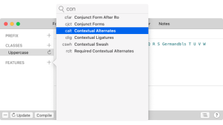
Then, in the Snippets menu in the lower right corner of the window, pick the Uppercase Sharp S snippet:
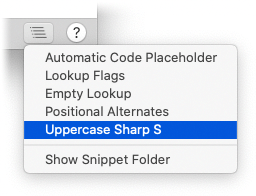
And the code gets inserted in your calt Contextual Alternates feature:
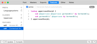
lookup uppercaseSharpS {
    sub @Uppercase @Uppercase germandbls' by Germandbls;
    sub germandbls' @Uppercase by Germandbls;
} uppercaseSharpS;
In the first line, lowercase ß gets replaced by an uppercase ß between two other capital letters. To also cover ß at the end of a name like Weiß, the second substitution makes the same substitution after two consecutive capital letters.
But careful, this could end up as a character change from U+00DF to U+1E9E, and unless we have a pretty good reason not to, OpenType features should stick to exchanging glyphs, not characters. So, assuming you already have Germandbls, make a copy of it and call it germandbls.calt. You can do so by choosing Glyph > Add Glyphs… and typing this in the dialog that appears:
Germandbls=germandbls.caltOnce you press the Generate button, you will have a component-based copy of your capital sharp S. Now, in your calt Contextual Alternates feature code, replace Germandbls with germandbls.calt, at the end of either line:
lookup uppercaseSharpS {
    sub @Uppercase @Uppercase germandbls' by germandbls.calt;
    sub germandbls' @Uppercase by germandbls.calt;
} uppercaseSharpS;
One remark. You may have asked yourself: why not already substitute lowercase ß after a single capital letter? Because there are a few cases in German where lowercase ß can appear after a capital letter, namely forms of ‘essen’ (‘to eat’): ‘Aß Tom Fleisch?’ (‘Did Tom eat meat?’) or ‘Iß deine Suppe!’ (legacy orthography for ‘Eat your soup.’). So we need to exclude this case. To my knowledge, there are no two-letter proper names that end in a sharp s, so that shouldn’t cause problems.
This is pretty well supported. Both Adobe InDesign and Quark XPress, all modern web browsers, and most modern Office apps support calt out of the box:
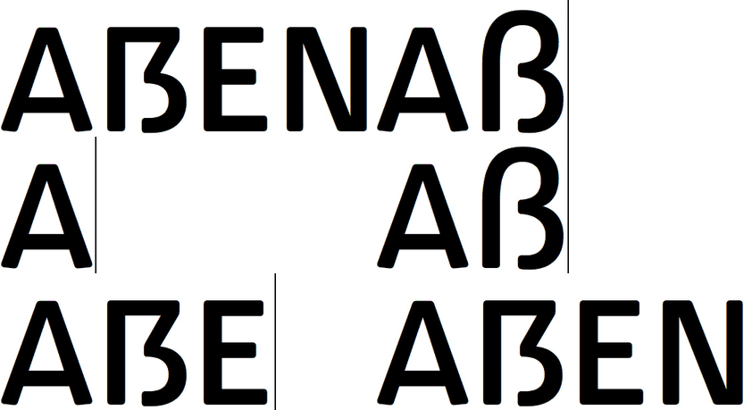
Even Apple’s language-agnostic CoreText engine is comfortable with contextual alternates. And it does not affect those users who choose to type or insert U+1E9E directly.
Resources
- Ralf Hermann: Capital Sharp S explained to Typographers, post-facto screencast of his talk held at the ATypI Reykjavík 2011. Good summary of the discourse, and a convincing case for including a cap sharp S in the German alphabet and in Latin type design.
- Ralf Hermann: How to draw a Capital Sharp S gives a good overview of all historic variants.
- Christoph Koeberlin: The German Capital Letter Eszett. Summary of the situation and design suggestions (disclaimer: my personal favourite is the ‘Frankfurt’ shape shown in Christoph’s article).
- Bruno Maag, Rainer Erich Scheichelbauer: The German sharp S, lecture at ATypI Antwerp 2018. Debunkings of common misconceptions about ß, and argued design suggestions.
- Rechtschreibrat: Grundlagen der deutschen Rechtschreibung. German orthography, in German only, sorry.
- Max Bollwage: Ist das Eszett ein lateinischer Gastarbeiter? Mutmaßungen eines Typografen. Gutenberg-Jahrbuch 1999, p.35f.
SAMPLE FONT: LAWABO BY SCHRIFTLABOR.
Update 2013-05-12: rewrote the OpenType feature part (removed locl and case hacks), added link to opentype.info.
Update 2015-10-18: updated link to Ralf’s article (thx Ondrej).
Update 2018-07-19: updated official situation to reflect changes in orthography. Minor changes.
Update 2018-08-10: new font with better cap sharp-s shape. Added link to Christoph Koeberlin’s article. Clarified the orthography part a little more.
Update 2020-12-22: added note, links, added Liechtenstein and Italy to the mentions of countries; and screenshots and updates for Glyphs 3 and Resources.


