

Multiple Masters, part 1: setting up masters
Thinking about producing a large font family? Then you need to draw and manage more than one master and to understand interpolation.
‘Multiple Masters’ (or short, MM) used to be a font format that would allow the font users to interpolate their own fonts. Probably due to its complexity and lack of support outside the Adobe realm, it never really gained much traction, and was discontinued in the late nineties.
For making large font families, MM interpolation technology still plays a significant role in modern typeface design. Needless to say, it is built into Glyphs. But first, we must understand the difference between masters and instances.
Masters vs. instances

Masters are what you draw. They are the input for the ensuing interpolation. Masters are organized in the Masters tab of the Font Info. You draw them on different layers of each glyph. When you are working on a family, you constantly jump back and forth between masters to make sure they will interpolate nicely. You set up masters in File > Font Info > Masters.
Instances or styles are what the computer calculates. They are the output, the exported result of the interpolation. Instances are organized in the Exports tab of the Font Info. In the case of Glyphs, they are spit out as prêt-à-porter OpenType fonts right away. If set up properly and everything works the way it should, you should never need to fiddle with the points or paths of an interpolated instance. You set up instances in File > Font Info > Exports.
Setting up masters
Alright, let’s get the party started. Once you have created a new Glyphs file, you pick File > Font Info and navigate to the Masters tab. One master is already there:

You see, it is named the Regular master. Attention: the name does not imply anything about the design of the master. The master may look very thin or even very fat. As a matter of fact, the name of the master, and the Icon you can choose, are completely arbitrary.
So, since you can pick any name for the master, it is probably best if you pick a name that makes sense to you. Some designers like to call it ‘Lightest’, ‘Boldest’, etc., to better differentiate them from the instances. The same applies to the Icon: pick one that makes sense to you.
In order to interpolate, we need two or more masters, distributed along at least one axis.
Adding axes
‘What is an axis?’, I hear you say. Easy: Axes are your interpolation dimensions. They define your design space. Take for example the three-dimensional design space of ABC Dinamo’s Arizona:
Glyphs lets you interpolate along any axis you define in Font Info > Font. That can be one of the ‘classic’ predefined axes, such as a Weight axis, a Width axis, an Optical Size axis, etc., or pretty much anything you can think of that makes sense to you. To create an axis, go to Font Info > Font, press the plus button next to the Axes headline, and an axis will appear:

You can pick any of the axes listed in the menu, or make up one of your own (a ‘custom axis’), but let’s stick with the Weight axis for now. Every axis comes with an axis name and a four-letter axis tag, in our case ‘Weight’ and wght. Now, we need to put masters on different positions of the axis.
Switching back to the Masters tab, you can now see that there is a new axis coordinate field for the Weight axis. We can put in any number that makes sense to you. Many designers like to pick the approximate stroke width for their weight axis. Let’s say a hundred in our case:

Now we need to add a second master, otherwise we cannot interpolate. You can either click on the plus button in the lower left and choose one of the options there:
- Add Master: add a new empty master.
- Add Other Font: insert the contents of a second .glyphs file as new master.
- Duplicate Selected: add a duplicate of the currently selected master as new master.
Or drag the name of the master in the sidebar, and simultaneously hold down the Option key, and the master gets duplicated once you release your mouse button. Once that is done, make sure you:
- change the name and the icon: this is only for yourself, as a reference. Pick a name and an icon that makes sense to you and that makes it easier for you to orient yourself when you switch through the masters.
- change the axes coordinates: this is paramount. You must have a different axis coordinate, otherwise you cannot interpolate. Makes sense when you think about it, because you cannot interpolate between 100 and 100.
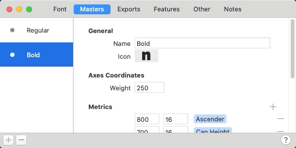
In our case, let’s give the Regular master a Weight value of 100, and the Bold master a weight value of 250. So we end up with two masters on our Weight axis, with weight coordinates 100 and 250:
Drawing the masters
Now, drawing is easy. Actually it is just like drawing anything else in Glyphs. The only difference is that you have to draw on two ‘master layers’. They correspond to the two masters we have just set up, hence their name. To switch between the master layers, simply press Cmd-1 and Cmd-2, i.e., the command key and the number of the master. This button appears as soon as you have two or more masters in your font, which you can alternatively use to switch between the master layers:

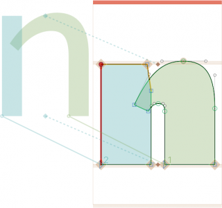
Okay, switch to the Regular master and draw a letter with a stroke width of 100. Of course you can start with any glyph in any script, but it is a good idea to pick a ‘productive’ shape. In Latin, I like to start with the n, because it can be recycled in the h, the u, the m, the i, the l, and so on. So, here is our n:

Remember: the term ‘Regular’ only is an arbitrary name for the master on the weight axis, and says nothing about the design of the letters you draw. So, don't worry if your n looks a bit too light or a bit too bold for what people would call Regular in real life.
Once you are finished with your n, select all and copy it to your clipboard. Then, press Cmd-2 to switch to the Bold master, and paste your n there. Then, start moving the nodes and make the n super fat. Usually, you want to reduce white space, so the letter can appear darker. After all, a bolder weight is supposed to achieve a darker color on the page. Thus, it is as important to make the counter smaller as it is to reduce the sidebearings a bit.

Consider adding a guide through the context menu and switching it to measurement mode. Do that by selecting the guide and activating the measurement option in the grey info box (Cmd-Shift-I). That way you can always see if your strokes are already thick enough, cool!
And when you are done drawing, consider correcting path directions and tidying up paths with the commands of the same name in the Paths menu. Here’s the deal: if you hold down the Option key, many of the Paths commands turn into an all-master mode. So now you can run Paths > Correct Path Direction for all Masters (Cmd-Opt-Shift-R) and Tidy up Paths for all Masters (Cmd-Opt-Shift-T), and they affect both masters at the same time:

Remember, you can always switch between them with Cmd-1 and Cmd-2. But once you are finished with the bold n, you deserve to take a look at them both side-by-side. You can do that with Edit > Show all Masters. Here is what our two n masters look like, including a subtle reminder about the shortcuts for accessing the masters:

Entering more values
Well, I suppose I couldn’t keep this a secret for long, because you have seen all the other entry fields in Font Info > Masters. Yes, as you would expect, all the number values there will be interpolated, as long as all entries are reciprocated in all masters. Whatever you do, you need to enter corresponding values in the same order in all other masters as well. This way, Glyphs knows between which numbers it is supposed to interpolate. This includes stem values, vertical metrics and all numbers entered in custom parameters.
Read on: Multiple Masters, part 2: Keeping your outlines compatible
Update 2014-06-20: fixed typo in Interpolated Nudge pro tip. (Thx Jeff Kellem.)
Update 2015-07-21: now with 3D and updated for Glyphs 2.
Update 2021-01-04: rewritten and updated for Glyphs 3.
Update: 2021-06-13: added Lottie animation by Abel Martins.