Sketching
There are many approaches to finding your letterforms. Many designers like to do a manual sketch first, and then digitize it. Most methods, if not all, have in common that they trace the shapes back to a specific tool. Here are two popular ways to get you started now with sketching your font.
In Latin type design theory, it is usually the broad-nib pen that plays the biggest role in the making of our letters. Other pens are possible, such as those with pointed nibs, or even completely different tools, like brushes. Or, you go the abstract way and try a completely geometric approach.
But many theorists will insist that even if you try to abstract by the means of different tools, it is still the broad nib you are abstracting from. So, in this tutorial, I will focus on the broad-nib pen.
Start with the n
Do not start with the a. Unless you have something special in mind, start with the n. It may not be the first letter in the alphabet, but its shapes reoccur a lot in other letters. It does not take a lot of imagination to turn an n into letters such as h, i, m, r, u etc., so the n is a great letter to start with.
Simulating a broad-nibbed pen
You can build your own broad-nib pen, for instance from a goose feather, or you can buy one. There are some modern variations to it, so you will not need to get your hands dirty with dripping ink. With some practice, you can learn to write pretty well with a broad nib.
But chances are, you will not have a broad-nib pen on you when you have that great idea for that letter. So, we will have to fake it. The characteristics of writing with a broad nib are simple: the width of the nib (the ‘front’) is fixed, and its angle in respect to the baseline hardly changes.
Sketching method 1: the double pencil
Take two pencils into your writing hand, perhaps tie them together with a rubber band, and start writing. Make sure you keep them at more or less the same angle throughout making the strokes:
Sketching method 2: wiggling
If you only have one pencil available, then you can loosely wiggle left and right while you are leading your hand along the stroke:
The wiggling simulates the broad nib. You will receive a good nib angle if you put the paper in front of you and keep it straight, and just use the natural angle of your lower arm. This method is a little trickier to acquire because it will take a little practice to wiggle at a consistent width and at a consistent angle. If you have never our first sketches
Adding details to your sketch
Whichever method you apply to get your first rough sketch, once you have the basic structure, you can see right away where the thicks and the thins need to go. Now, you can take a single pencil, and draw the outline, and add some detail:
Digitizing your sketch
Again, there are different approaches. Here is one that works well for most people. In a nutshell, you start out with straight lines, placing points only very roughly at first. We will add precision and curves later.
First, in your sketch, you mark your corners, your extremum points, and the points where curves change into straight lines. What are extremum points, you ask? These are all points on every curve that have a perfectly horizontal or vertical tangent. So, your sketch may now look something like this:
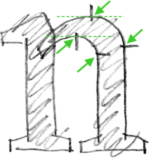
Approximate nodes
And now, go into Glyphs, and create a new font with File > New (Cmd-N). Double click the n, and pick the Draw tool (P). And now, click to add straight lines, one point at a time. You can do that just very roughly, you do not need to be precise at this stage. Actually going for precision now already is just a waste of time. Just approximately put the nodes between baseline (second line from below) and x-height (third line from below):

Approximate the relative positions of the nodes. For instance, the extremum point on the inner arch appears to be not exactly in the center between the two stems, but slightly to the right of it. Ask yourself questions like: ‘Is the top node above the right stem?’ Place your nodes accordingly. Again, it does not need to be very precise, an approximation will do.
Close paths by clicking in the first point again. Keep overlaps. Again: no curves, no precision yet. Finish this step with Paths > Correct Path Direction (Cmd-Shift-R). Path direction determines whether overlaps appear white or black. The command also reorders the paths and sets the start points (indicated by triangles).
Align and move points
Now, we will start adding precision by aligning points that need to be at the same x or y coordinate. With the Select tool (V), select points that need to be aligned, and choose Paths > Align Selection (Cmd-Shift-A). You will use this a lot, so it is probably a good idea to memorize that keyboard shortcut:

Glyphs seems to be smart enough to figure out whether you want to align horizontally or vertically. What it does internally, is pick the alignment that is the smallest change.
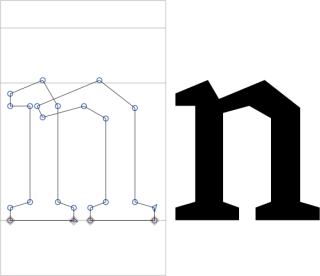
Now, with the arrow keys on the keyboard, move the points into position. Add the Shift key for increments of 10 units, and the Cmd key for increments of 100 units. Put the lowest nodes of your n onto the baseline. Once they reach the line, they will be marked by a diamond indicator.
The extremum point of the top arch needs to be slightly above the x-height, which by default clocks in at 500 units. We call this the overshoot, an optical compensation that makes sure the arch will later appear to be at the same height as horizontal things at the x-height. Most overshoots are between 10 and 15 units. Around 10 if your design is intended for display sizes, a little more if it is intended for smaller sizes.
Our n now looks like this:
Equalize stems
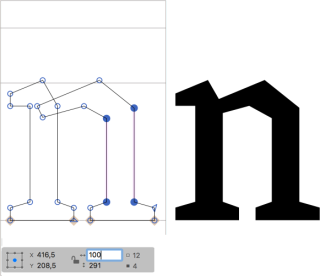
Then, we need to sync distances between nodes. In the case of our n, that means that we need to make sure both stems have the same width. One stem at a time, select the four nodes that make up the stem. Then, take a look at the grey info box (View > Show Info, Cmd-Shift-I), and make sure the lock is open. That way, we can edit width and height independently of each other.
Now find a good, round value for the stem width, controlled by the number next to the horizontal double arrow on the grey info box. Apply the same width to both stems.
Add curves
Enough of those straight lines already! Switch to the Select tool (V), hold down the Option (Alt) key, and click on the segments to add grey handles to the segments. In case you added too many handles, you can select a handle and delete it with the Backspace key, and your segment will be turned into a straight line again.
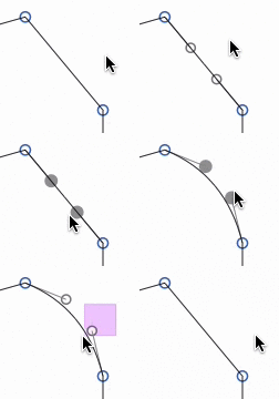
Once you have handles on all your segments that need to become curvy, you can simply drag them into position. Handles snap as soon as they are horizontal or vertical, which is what they need to be anyway around extremum points.
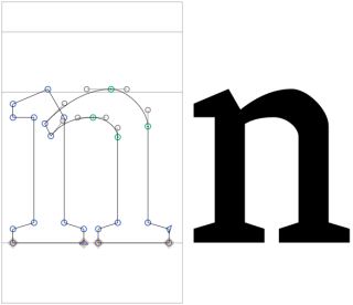
Most likely, you will also have two handles inside the overlap in the left stem. Usually, these two do not need to be horizontal or vertical, but at an angle. Make sure they both have approximately the same angle. This will facilitate the next step.
Your n now may look something like this:
Adjust curvatures
Select some handles of the outer curve segment and bring up the palette sidebar (Window > Show Sidebar or Cmd-Opt-P). In the Fit Curve section of the Palette, click on the buttons (or press Ctrl-Opt-1 through 8):
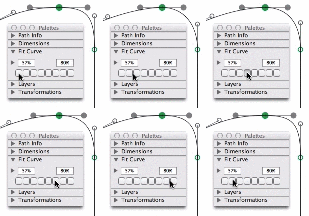
The curvature of a segment is measured in relative handle lengths. 0% means completely retracted handles, 100% is where the two handles of a segment intersect. A curvature of 0% makes no sense because it can better be represented by a line segment, i.e., without any handles. A curvature of 55% is elliptical, i.e., that is the handle length you need for a geometric circle. In type design land, we usually need something higher than that. Even in very geometric design, curvatures are at least 57 or 58%. At the other end of the spectrum, we usually end up with curvatures just under 80 percent. Between you and me, personally I like to set the outermost values to 58% and 76%.
But how do we make inner and outer curves match? Easy. The secret is that inner curve segments have a higher curvature than their opposing outer curves. And this is how you do it: Select handles of the (smaller) inner curve, and give it a higher percentage (e.g., Ctrl-Opt-5), then select handles of the (bigger) outer curve and give it a lower percentage (e.g., Ctrl-Opt-4).
Experiment with the values until you are content. The difference in curvature will typically be more in very bold designs where the distance between inside and outside curves is high, and the inner curve will be significantly shorter than the outer curve. On the other hand, you may end up with the exact same curvature for both opposing curves in very thin hairline designs because both curves are practically the same.
Iron out curve bumps
Perhaps you see something that looks like a little bump in the curve, pretty much exactly where the two curve segments meet in the extremum node. That can happen if the actual curvature abruptly changes from one segment to the other. Now look closely. To one side of the extremum point, the curve looks rather flat, towards the opposite side, it bends away quickly.
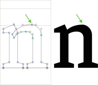
Select the green node in the middle, hold down the Option key, and move the node towards the flatter part. You can do that with either the arrow keys or the mouse. By holding down the Option key, you keep the handles where they are, effectively moving the node between the neighboring handles:
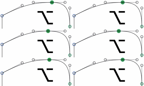
Effectively, you squeeze the flat part together and thus make it more curvy. At the same time, you stretch out the curvy part and make it flatter. Somewhere on the way, you will hit a sweet spot were both curvatures match and the bump is gone. This is what people sometimes call ‘G2 continuity’.
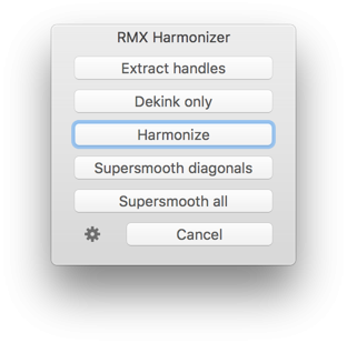
If you have the full version of Glyphs, there are third-party plugins available that will help you turn bumpy curves into smooth outlines. Firstly, we can recommend Tim Ahrens’ Remix Tools which contains a filter called Harmonizer (after installation, choose Filter > Harmonizer) that tries to re-arrange nodes in a way that bumps like these get ironed out.
Then, there is Yanone’s psychedelic SpeedPunk tool, that helps you spot curvature problems. It only visualizes the curvatures, you stay in control of your curves:
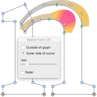
SpeedPunk is available for free in Window > Plugin Manager.
Ta-daa!
Congratulations, you have finished your first n:
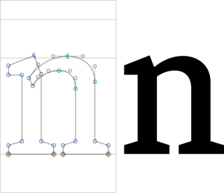
From here, you can either draw the next glyph, or adjust the sidebearings of your letters, or test your font in an Adobe app. Don’t forget to set a font family name in File > Font Info > Font.
Pencil sketches by Stefan Willerstorfer
Update 2020-10-16: adjustments for Glyphs 3.
Update 2022-07-19: minor formatting.


