Font Info settings in Glyphs Mini
Glyphs Mini’s Font Info section stores important general information about your font such as the font names, the vertical metrics, and the alignment zones. Once you have read the step-by-step description in this tutorial, you will be able to use it efficiently.
Open the Font Info tab with File > Font Info (Cmd-I). Then, you can tab through the settings:
Font names

The most important settings in your Font Info are two names: the Font Family Name and the Style Name. They are the big letters on grey background at the top of the tab.
-
Font Family Name: The words on the left, by default ‘new Font’, are your Font Family Name. If multiple fonts share the same family name, they are grouped in the same font submenu, for instance in the font menus of apps like Adobe InDesign. You can use capitalization and word spaces, but do keep the family name short (less than 20 characters in total), and only use ASCII (A-Z, a-z, 0-9). No umlauts, accents or other non-ASCII special characters. For maximum compatibility, it is advisable to avoid a dash in the family name as well. Just saying. Also for maximum compatibility, it is best to start the family name with a letter (A-Z, a-z), even though it is technically possible to start with a figure (0-9). Some apps may complain, list the font wrongly or not at all.
-
Style Name: on the right, by default ‘Regular’. If multiple fonts do share the same family name, they have to be differentiated with style names. Very much like brothers and sisters need different first names if they have the same family name. Typical style names are Light, Regular, Book, Medium, Semibold, Bold, Heavy, Black and Light Italic, Italic, Book Italic, Medium Italic, Semibold Italic, Bold Italic, Heavy Italic, Black Italic, you get the idea. But you can have unconventional names as well, like Grunge, Supercool, Dotted, or Laser, whatever describes your design best. Again, keep the style name short, and stick to plain ASCII.
Vertical metrics
These settings describe some important measurements of your font and influence how your font is displayed in some apps. For instance, apps calculate the first baseline offset based on these numbers.

- Cap Height: The height of your capital letters, best measured at a straight and simple letter without overshoots, e.g., uppercase H, T or I. Most type designs have values between 600 and 700. If your design is much larger, consider changing Units per Em value in the bottom right corner to something that encompasses both cap height and descender. If your font is an icon font, it is best to leave it at the default of 700.
- x-Height: The height of lowercase letters without an ascender, again, best measured in designs that do not have overshoots, like lowercase x, v, w, y or z. If you do not have lowercase letters in your font, make sure it is a value lower than the cap height. Typical x-heights are around 500 units tall, give or take a few.
- Ascender: The height of lowercase letters with an ascender, such as lowercase b, d, f, h, k, l, or the Icelandic þ and ð, not counting overshoots. (Note: the lowercase t usually exceeds the x-height, but does not reach the ascender.) These letters are typically the highest (unaccented) letters in a type design, also exceeding your cap height. If you have a design that reverses that relationship, i.e., caps are higher than ascenders, consider using the Ascender value for your caps, and vice versa. Typically, ascender heights are somewhere between 700 and 800.
- Descender: A negative number value representing the depth of lowercase letters with descenders, such as g, j, p, q, y, and the Icelandic þ, again not counting overshoots. In italic designs, letters like f and the German sharp ß sometimes also have descenders. If your design does not have lowercase letters or maybe not even any letters at all, as in an icon font, it is a good idea to leave this value at its default -200.

The following two settings, the standard stems, are only important for hinting and a few functions like Open Corner form the context menu. If your font does not lend itself for hinting, you can leave these blank. Your font is ready for hinting if:
- your design has extremum points set (Glyph > Add Extremes),
- is a regular text letter design with recurring, similar shapes in its letters (what most people would call a ‘normal font’),
- prioritises legibility over shape fidelity,
- has no special effects like roughened outlines, inlines, flourishes, very fine details, dashed and dotted lines, many nodes (more than a dozen or two), etc.
If, on the other hand, your font is a symbol or dingbat font, or does something fancy with its outlines, like a grunge font, it is better to skip the two stems settings.
- Vertical Stems: The average thickness of your vertical stems. This value will be used to unify and harmonize the number of pixels used to display the thicknesses of vertical stems in low-resolution circumstances. The idea is that if one letter uses, e.g., two pixels for its stems, all the other letters use two pixels as well. So, try to use only one good average value that more or less fits all your letters. Say, you measure the thicknesses of the stems of n, o, H and O, and you get 50, 56, 62 and 68, it is best to enter only one average value of 60. Entering multiple values can lead to a situation where, at certain screen sizes, some letters have stems of one pixel, where others have stems of two pixels, which amounts to a 100% difference.
- Horizontal Stems: The average thickness of your horizontal stems, best measured in the crossbars of letters like lowercase e, f, t, uppercase A, E, H, or T, or the near-horizontal curves of letters like lowercase c, o, s, or uppercase C, G, O, and S. Again, try to find only one good average stem value.
And at the very end of the row, there is a setting that only applies to italic designs:
- Italic Angle: the clockwise inclination of your design, in degrees. Simply put, it is how much to the right your font is leaning. Leave at zero if your font shows no inclination, enter a negative value for backslanted designs. This has two effects: Firstly, it is stored in the final exported font files, and some apps use these values to calculate the slanting of the text entry cursor. Secondly, it slants your measurement box in Edit view, to facilitate editing of italic designs.
Alignment zones
Like the standard stems above, these settings are intended for hinting and screen optimisation. You can also use them as a design reference for your overshoots. If you decided to not set stems because hinting does not make sense for your font, you can skip the Alignment Zones and move on to the next section.

You can click the Update button, and Glyphs Mini will try and guess your zones. Alignment zones define areas for overshoots and serif cups at your vertical metrics: descender, baseline, x-height, cap height and ascender. The idea is that, at low resolutions, whatever reaches into alignment zones is flattened (‘suppressed’) until a certain pixel size. This is is necessary if an extra pixel would be too much of a difference:
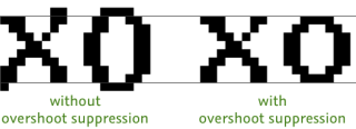
Each zone setting consists of two values: a position and a size. The position should coincide with a vertical metric line (this includes the baseline at position zero). The size is positive for top overshoots at x-height, cap height and ascender, but negative for the bottom overshoots at baseline and descender. An overshoot should encompass anything that is supposed to be flattened onto the same pixel height at a low screen resolution. To give you an idea, here is a typical zone setup:

You need to follow some important rules when setting up your zones, otherwise it will not work as expected:
- You can have no more than five top and six bottom overshoots (including the baseline).
- Zones must never intersect or overlap each other.
- Zones should be kept small, best not exceed a size of 25. (Yes, it is more complicated than that, but you are on the safe side in almost all cases if you keep them below 25 units.)
- The baseline zone must have position zero.
- If your grid setting is finer than 1/1 (e.g. 1/10 or 0/1), expand your zones by one unit in both directions, i.e., let each zone start one unit earlier and end one unit later. E.g., the zone
800/16should be expanded to799/18. Except the baseline zone, of course, which must remain at position zero, e.g.,0/-14becomes0/−15.
Once you have stems and zones set up, you can export (File > Export, Cmd-E) with the Autohint option on. To see if the hinting settings are right, you need to test your font in Adobe apps such as InDesign or Illustrator. To do this, it is strongly recommended to use the Adobe fonts folder.
Meta infos

This part of the Font Info has no technical implications, they do not change the workings of your font. If your font is just for personal or internal use, you might as well leave these all empty. But if you plan to hand out your font to other people, be it for free or for money, it may be better to include this.
- Designer: This is your name. Or the names of the people involved in creating the font. Let the world know who made this font.
- Designer URL: URL for your website. The spec requires the protocol be mentioned (usually,
http://orhttps://for websites). - Manufacturer: Whoever releases your font. Can be your foundry, your agency, or the company to which your font project is linked to.
- Manufacturer URL: URL of the Manufacturer website. The spec requires the protocol be mentioned (usually,
http://orhttps://for websites). - Version: A version number for your font. Will show up in file info (Cmd-I) in the Mac Finder. Do not forget to increase the number when you are releasing a new version of your font. Referring to a version number can facilitate dealing with support issues significantly. Some validation software out there will consider fonts with version numbers below 1.005 as ‘pre-release’ and warn the user accordingly. So start counting at 1.005. Major changes in the design should be reflected with the single-digit number on the left (a.k.a. major version number). You can use your up and down arrow keys or the buttons to change the triple-digit value (a.k.a. minor version number).
- Copyright: You can use the Update button to let Glyphs Mini autogenerate a valid copyright notice. If you want to release our font as a free, open-source font, it is advisable to remove the part that says ‘All Rights Reserved’.
- License: According to the spec, this is supposed to be a nutshell summary in plain English of what the user can or cannot do with the font, something like Share freely or Only Company X is allowed to use this or Install on max 5 machines. However, many foundries slap in their complete license. Careful if you plan to sell your fonts through reselling platforms. Some of them insist that you do not add any licensing info to your font before you hand it in, because the font may be sold with different licenses for different formats. In other words, they may want you to leave this field blank. So: Ask your reseller before you do anything fancy here. If, however, you want to release your font as a free open-source font, consider the SIL Open Font license.
Style information
If you only make a single font, you can skip this chapter and move on to Grid Settings further below. But if you are creating a little font family, these infos are important.

Style linking establishes Bold/Italic relationships between multiple fonts. Apps use this info to bring up the right font when you press Cmd-B or Cmd-Shift-B (in InDesign) for accessing the Bold font, and Cmd-I or Cmd-Shift-I (InDesign) for accessing the Italic. In short, every Italic should be established as the Italic of its upright counterpart, while the Bold and Bold Italic fonts should be the Bold or Bold and Italic of the normal/regular style. Use the attributes both Bold and Bold & Italic only once.
Sounds complicated? Fair enough. Let me give you an easy overview, assuming that your default style is called Regular:
- Thin: —
- Thin Italic: Italic of
Thin - Light: —
- Light Italic: Italic of
Light - Regular: —
- Regular Italic: Italic of
Regular - Medium: —
- Medium Italic: Italic of
Medium - Semibold: —
- Semibold Italic: Italic of
Semibold - Bold: Bold of
Regular - Bold Italic: Italic and Bold of
Regular - Heavy: —
- Heavy Italic: Italic of
Heavy - Black: —
- Black Italic: Italic of
Black
The dash means, ‘leave the setting empty’. Plus, if your default style is called Book instead of Regular, you will need to reference it with Book, of course.
The weight and width settings change the sorting of the style submenus in Adobe apps. InDesign, Illustrator and Photoshop sort first by Width and then by Weight. If both are the same, then the styles are sorted alphabetically.

The settings are pretty self-explanatory. Simply pick something from the menus that best fits your design, and you are done.
Attention: Please do not ask us how style-menu sorting is done in Apple apps such as TextEdit or Pages. No one knows, and Apple will not tell us. The Mac system does several heuristics on your font family, probably even including measuring some of your glyphs. The only thing we have found out over the years is that for a font to be recognized as upright, it must have an Italic Angle of zero, and for an italic, it must have an Italic Angle other than zero. That is all we know, sorry. If the fonts do not sort the way you expect them to sort in these apps, we cannot help you.
Grid settings
Towards the bottom of the Font Info, you will find settings for the outline grid. It shows two values, Grid Spacing and Subdivision:

In almost all cases, you want to leave both values 1. In the few remaining cases, the effective grid step, i.e., the places where you actually can put nodes, is determined by Grid Spacing divided by Subdivision.
If you are creating very detailed drawings and you find the grid to coarse, you can increase the Subdivision value. A Subdivision value of 2 gives you half-unit steps through the grid, i.e., it enables .5 coordinates. Maximum value is 100, i.e., two extra decimals for coordinates.
If you need a coarser grid, e.g., for a pixel font or a very modular design, consider a higher Grid Spacing value. A Grid Spacing value of 100 in combination with a Subdivision of 1 will allow nodes only at multiples of 100.
Units per Em
The Units per Em (or in short, ‘UPM’) is the number of font units that make up the font size, default is 1000.

An em is a font-size relative length measurement, where one em is exactly the font size. So, at a font size of 12 points, one em is 12 points. Since we are designing scalable vectors, all our measurements must be independent of specific font sizes, and thus an em is the ideal measurement for type designers.
In other words, by default, each unit is a thousandth of the font size. That means that, if you change the UPM value, you effectively scale the font:
- increase the UPM number if the font appears too big compared to other fonts
- choose a smaller number if the font appears too small
Re-export, best into the Adobe fonts folder or the TextPreview watch folder, and see if the new size fits your needs better.
Warning: Software may expect your UPM to be relatively normal. From experience, make sure your UPM value stays below 4000. This is the threshold beyond which users have been reporting troubles in office software. If you know in which software the font is going to be used, feel free to go higher than that, but do test extensively before giving the files out of your hands.
Update 2019-09-23: grid Settings and Units per Em rewritten.
Update 2020-02-16: corrected typos.
Update 2022-07-28: updated title, related articles, minor formatting.


