
Creating icons
Let’s create a set of icons, for wayfinding, web, UI and UX design.
Let’s say, for story-telling purposes, that our client has asked us to do a whole bunch of icons, among which two representing the concepts of ‘enter’ and ‘exit’. They are supposed to look consistent and you may need to deliver them in different sizes and formats.
Let’s go. We start by choosing File > New Icon Set:
A new document opens, and it already contains one emoji, a grinningFace (😀):
That is not what we want though, let’s rename the emoji glyph to icon.exit by clicking into its name and overwriting what was there. Alternatively, you can select the glyph and press Return or Enter, which selects the glyph name, and start typing.
It is generally a good idea to think of a smart naming strategy, think of something easily sortable and searchable, e.g. category.individualName. Your mileage may vary given the task at hand.
A glyph name must consist only of ASCII letters (A-Z, a-z), figures (0-9) as well as dot, hyphen and underscore (
.-_). A name cannot contain spaces, and no other character beyond the aforementioned ones.
Careful with the allowed punctuation, though. A leading underscore is a convention of a non-exporting helper glyph. Underscores elsewhere in the name serve as ligature connectors, hyphens separate trailing script indicators. If that does not tell you anything, don’t worry. The giveaway for now: don’t use underscores and hyphens just yet. Stick to dots for bringing a structure to your names.
In order to edit our icon, let’s double click it. A new Edit tab opens, with our icon.exit open for editing. Let’s pick the Rectangle tool (shortcut F), and drag a square into the framed area of our glyph. The frame represents the edge of the image, anything exceeding it will be cut off. So I guess we better stay within the bounds. We do not need to be precise when dragging it because with the square selected, we can simply type the x and y coordinates for its center, as well as its width and height in the grey info box appearing below. Shall we put it in the center and make it 700 high and wide? Just click in one field, type the respective value, then tab to the next field, repeat until done:
In case you wondered, the lock button is for keeping the current height/width proportions when changing either value. The nine-point transformation origin works exactly as you imagine it. The figures on the side indicate the number of total and selected path points.
Now let’s give our square a good stroke, and by that I mean the Stroke setting in the bottom right of the window. Type in the stroke width (marked with the horizontal double arrow), or, use your up and down arrows for changing the existing value. Combine the arrow keys with Shift (⇧) for steps of 10, Shift-Command (⇧⌘) for steps of 100. I love me a value of a hundred, and I love my stroke to go into the inside, so I will pick the first of the three stroke position buttons:
Next step. Let’s round the corners. For this we select the rectangle with the Select tool (shortcut V). Drag-select across it, or double click it and the entire shape is selected. Then, run Filter > Round Corners, and pick a rounding radius you like:
The Visual corrections option will pull the curve handles and on-curve nodes apart a bit so the curve transitions more smoothly into a straight line than a flat circle would do.
For the opening, we add another rectangle, just like we did before, only this time, we define it as a subtracting mask: in the bottom right, we click on the Not a Mask pop-up and switch it to Subtract:
Now, for the arrow, we click twice into the canvas with the Draw tool (P), the one with the pen icon in the toolbar. Now we have a line. In case we forgot to hold down Shift (⇧) and didn’t draw it horizontally, we can select it and press Cmd-Shift-A, the shortcut for Path > Align Selection, and the nodes will align orthogonally. If you are not a shortcut person, you can instead press the align button in the Transformations panel of the right sidebar.
For the arrow head, let’s try something cool. Choose Glyph > Add Glyphs… (⇧⌘G), and in the dialog that pops up, type _head.arrow, and press Generate:
Cool, and we get a new glyph called _head.arrow. You guessed it, the prefix _head has a special meaning: it is a head component that has the superpower of attaching to an open path end. What we will do is draw an upward facing arrowhead:
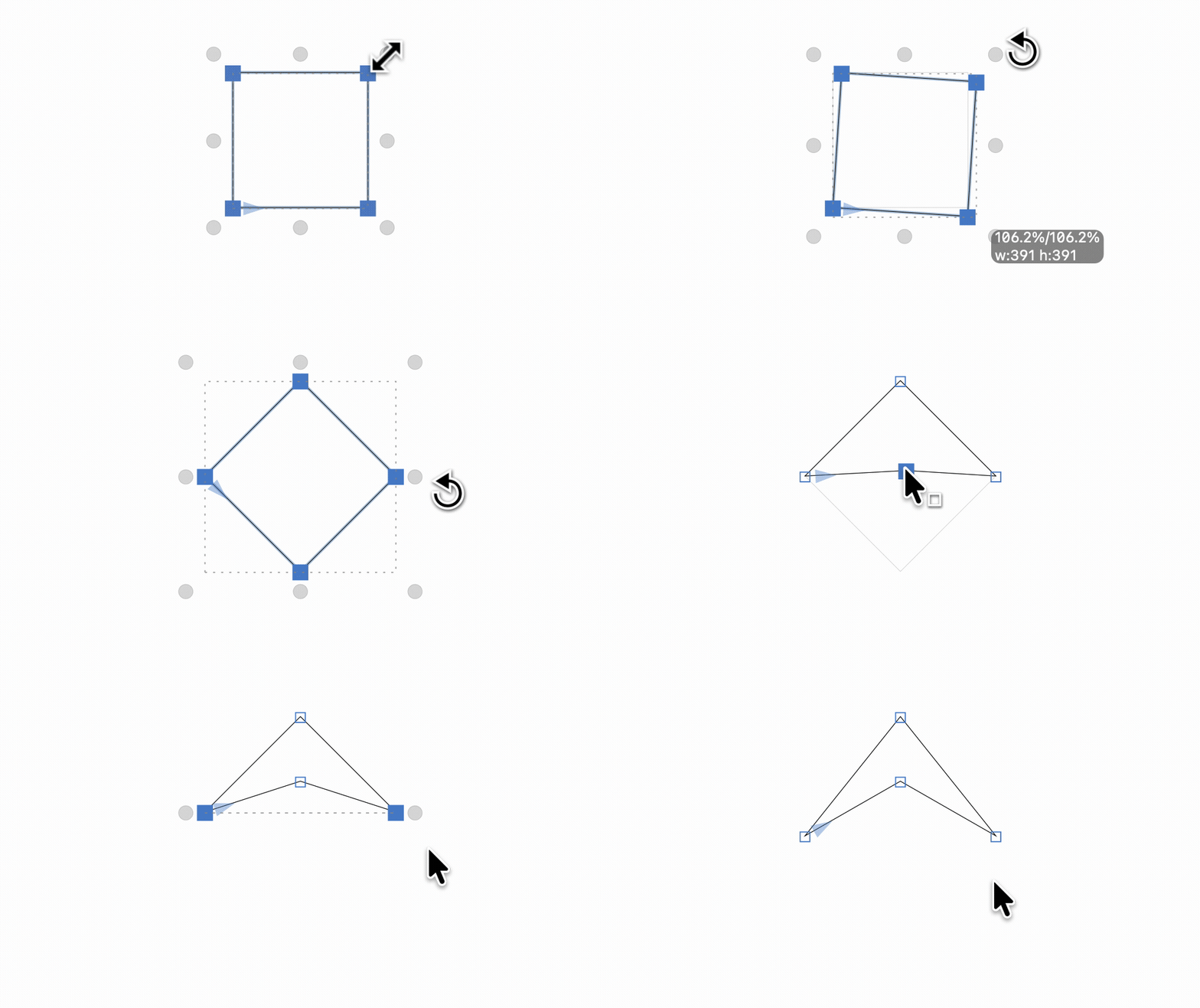
We start with a square, created with the Rectangle tool (F), select it, then move your mouse pointer a bit beyond one of the transformation handles to trigger a rotation. Note how the mouse arrow changes into a rotation symbol. Start dragging, add Option (⌥) for rotating around the center, Shift (⇧) for steps of 45°. The rest is easy peasy.
Do not forget to add anchors: choose Glyph > Set Anchors (⌘U), or Reset Anchors (⇧⌘U) in case you need to overwrite anchors you accidentally added before. This will add default anchors for head glyphs: direction and origin. Pull them apart vertically, keep the direction anchor below the origin anchor, it controls the orientation of the arrowhead and we want it to go straight. The origin anchor is where the arrowhead will dock onto the open path end, so you probably want to keep that one inside the shape.
Why do we do this in a separate _head glyph and not directly in the icon? Easy. So we can reuse it. In a set of many icons, you will likely have dozens of elements that are repeated over and over again. This is why Glyphs offers all kinds of components to make reusing shapes as efficient as possible.
Let’s attach the arrowhead to the end of the line in our icon. To move back to the icon, simply double click it to make it the active glyph again. In case the glyph does not show up in your Edit view anymore, you can insert it with Edit > Find > Find… (⌘F) and choosing which glyph to insert in the dialog that follows.
Anyway, let’s select the outer end of our stroked line, right-click to bring up the context menu, and pick Add Head, answer the dialog that follows, and here we are:
I admit it, I kept tweaking the arrowhead until it looked that way. Hint-hint: there’s a lot of things you can do through the context menu, depending on your selection: open corners, sharpen corners, reconnect nodes, you’ll get the hang of it quickly.
What is missing is some tweaking of sizes so it fits in the square, because that is what our client has asked us for. Easy: select with the Select tool (V) and shift-arrow key the shapes into position. And now, we can turn the rounded square (or what’s left of it) into a component too: double click to select it, right-click to open the context menu, choose Create component from selection…:
That means we will move the shape into a separate glyph so we can reuse it as a component all over the place. But we have to name that glyph first, and Glyphs will ask you for it. I suggest _part.square, which will create a non-exporting glyph because it starts with an underscore. _part is a good choice because it is a searchable and sortable prefix that also allows for some extra tricks.
Alright, let’s do another icon. Choose Glyph > Add Glyphs… (⇧⌘G) and this time, we type icon.enter and press Generate. And you can guess the procedure:
- Glyph > Add Component… (⇧⌘C) and pick
_part.square - Draw a rectangle and position it over the left side of the square, make it a mask, just like we did before. (Or steal it from
icon.exit.) - Do the same for the arrow.
- Rearrange the shapes.
Cool, works, though there is something odd:
The enter icon looks much tighter than the exit icon. An optical illusion that is in need for a correction. How would we do that? We need to adjust lengths of arrows and the sizes of the squares.
But if we scale the square, we distort it. Not good. What if we could tell the square what it should look like at different scales? Turns out we can do just that.
Double click the square component and it will open the square glyph for you. Now, open the left sidebar (with the button in the top left of the window), pick the slider tab (the third one), and you are greeted with a ‘No Axes’ message. Click on the plus button in the lower left corner of the left sidebar, and add an axis called Width (case-sensitive) and default value 100:
Now go to the Layers palette on the right sidebar, and add a new Intermediate layer through the plus button there:
Pick a higher number for its coordinate, say 150. We are now on the ‘Width 150’ layer, we can proceed to make the square wider. Back in the two icons we made, we can now select the square component, resize them horizontally, and they will preserve their stroke thickness:
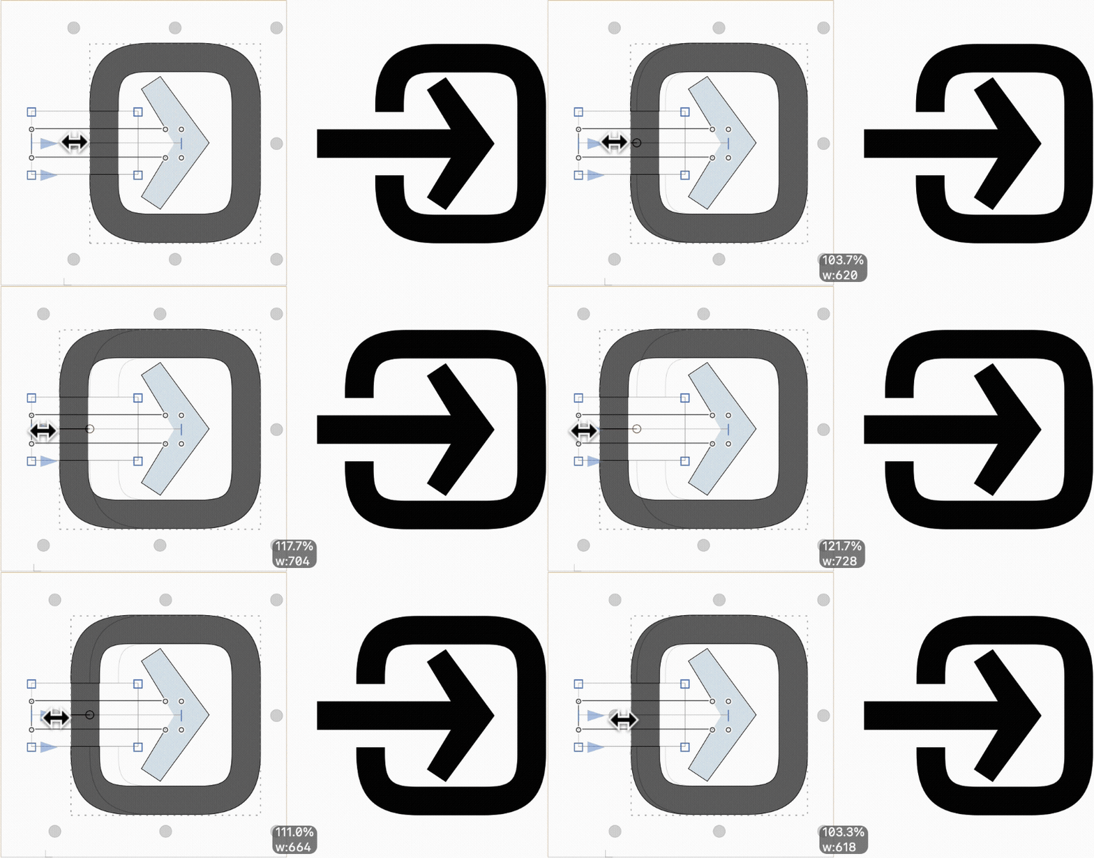
Congratulations, you have just made your first smart component, which allows you to reuse shapes and make them adjustable at the same time. That means we can adjust the shape of the squares in our icons.
Ta-daa! Now the big moment has arrived. It is time to export our icons into real tangible images. The client is waiting, after all. All you need to do is pick File > Export (⌘E), and a dialog opens:
Decision time. We sure want to export all glyphs. We can pick any format between PNG, SVG and PDF. Then, we pick an export destination, so we activate the respective checkbox and click on the Finder path and pick a good spot. The export dialog remembers the destination now, and we can re-export and overwrite all the icons in one go every time we make changes.
Click on Export (or press Enter), and here we go:
Amazing, our client is going to be so happy.
For more sophisticated export options, you can open File > Font Info (⌘I), switch to the Font Info window’s Exports tab (⌘3), and Glyphs confronts you with your personal horror vacui:
Fear not, we just need to click on that plus button in the bottom left, and an Icon setting appears. Here you can add Presets and configure:
- image format: PDF, SVG, or PNG
- size: the pixel height to which 1000 units are going to be scaled
- resolution: scale factors 1×, 2×, 3× correspond to 72, 144, 216ppi, effectively doubling and tripling the pixels in a PNG
- name: add a structure, placeholder tokens are available with triple braces,
{{{glyph.name}}}represents the name of the glyph,{{{layer.width}}}would be the total unit width of the glyph. - gearwheel options allow to extra padding and a different precision in the vector-to-pixel transition: smaller values mean a higher precision, 0 is the max precision; it only really makes a difference for highly detailed designs.
This way you may end up with multiple versions of each and every icon you drew in your Icon Set file:
And every time you export, all of the variants will be regenerated and overwritten. That’s pretty cool.