

Figures: superscript (superior) and subscript (inferior) figures
The final figure frontier: superscript, subscript and scientific subscript figures. Implement those with this quick step by step tutorial.
I assume you already have fractions. We will reuse them for the superscript and subscript figures.
Superscript: the sups feature
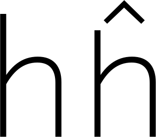
Imagine m squared for square meter, imagine x to the third power. This is the height the superscript figures ought to have. Depending on your design, exact copies of the numerators may do. Many designs need them shifted a little higher, though:

So, how do we do that? Go to Glyph > Add Glyphs… (Cmd-Shift-G) and create component copies of your denominators with a simple recipe:
zero.dnom=zerosuperior
one.dnom=onesuperior
two.dnom=twosuperior
three.dnom=threesuperior
four.dnom=foursuperior
five.dnom=fivesuperior
six.dnom=sixsuperior
seven.dnom=sevensuperior
eight.dnom=eightsuperior
nine.dnom=ninesuperior
Then select the superior glyphs (in Font or Edit view, it does not matter) and shift them up: You can push them all up in one go with Path > Transformations. Enter an appropriate value in the Translate Y field and you’re good to go:
In File > Font Info > Features, click the Update button, and Glyphs will generate the sups (superscript) feature:

Please note that with this method, i.e. using onesuperior instead of the name suffixed with the feature tag like one.sups, the superior glyphs will receive separate Unicode values. Thus, the feature will mess with the characters rather than just glyphs. According to the official spec, that is OK:
This can include a change of semantic value. Besides the original character codes, the application should store the code for the new character.
The magic word here is ‘change of semantic value.’ OpenType features usually are not supposed to do that, i.e., change the Unicode value, and thus, change the semantic value. There are, however, a few exceptions, and luckily, sups is one of them. So, our feature code is OK, and that is why we recommend this method whole-heartedly.
Subscript: subs vs. sinf
What? Two different OpenType features for subscripts? In the official wording, subs (subscript) is for:
The ‘subs’ feature may replace a default glyph with a subscript glyph, or it may combine a glyph substitution with positioning adjustments for proper placement. […] Note: This is a change of semantic value. Besides the original character codes, the application should store the code for the new character.
The point, again, is that subs can trigger a ‘change of semantic value’, i.e. fiddle around on the character level. Theoretically, OpenType features are not supposed to do that, but in this case, Unicode already had subscript figures encoded, so we might as well reuse them for the feature.
And sinf (scientific inferiors) is intended for scientific use:
Replaces lining or oldstyle figures with inferior figures (smaller glyphs which sit lower than the standard baseline, primarily for chemical or mathematical notation). May also replace lowercase characters with alphabetic inferiors.
So, when the chemical formulae for carbon-dioxide and water need inferior twos, this is a job for sinf:

It is totally legit that you want your subs figures to be identical to your sinf figures. However, sinf officially does not condone a semantic change. It is not a problem to do that anyway, and simply use the same set of inferior figures for both. That is also what we recommend.
You can achieve that if you employ figures with an inferior suffix, without the dot. To create them, paste this in the dialog that appears after you call Glyph > Add Glyphs…:
zero.dnom=zeroinferior
one.dnom=oneinferior
two.dnom=twoinferior
three.dnom=threeinferior
four.dnom=fourinferior
five.dnom=fiveinferior
six.dnom=sixinferior
seven.dnom=seveninferior
eight.dnom=eightinferior
nine.dnom=nineinferior
Press Generate and Glyphs will create the new glyphs as component copies of the denominators. Then, push them down with Filter > Transformations, just this time with a negative Translate Y value.
Proceed to File > Font Info > Features and press the Update button, and Glyphs generate both the subs and the sinf feature with them. And you’re done, congratulations!
Useful scripts
All of the steps described above are pretty tedious. I understand you very well if you wish all of that could be automated. I was in the same situation. That is why, in the mekkablue script collection, there is the Build Glyphs > Build Small Figures script. When you run it, you get a dialog that looks like this:

And it does exactly what it says, so using it should be pretty straightforward:
- In the Default Suffix field, type in the suffix of your ‘base’ small figures. I.e., everything that follows the mere
one,two, etc. Typically, this will be.dnomfor the denominators, because denominators tend to stay on the baseline, so they are a good starting point.
Your default figures should be outline-based, i.e., not contain other small figures as components. If you are unsure, use the Decompose small figures with Default Suffix option. - In the Derivatives, list all the suffixes of the derived small figures, each of them followed by a colon and a vertical offset value in units. Separate multiple entries with commas. If the suffix has a dot, do not forget to include the dot. E.g.,
.numr:250, superior:350, inferior:-125. - Press the Build button. The script will then rebuild the small figures as composites. As components, it will use the figures with the default suffix.
Cool. Glyph creation and composite transformation all in a single step. And with the time saved, we can go for a coffee now.
Edge case Avoiding semantic change
If, for whatever reason, you want to avoid the semantic changes we mentioned above, or you need to keep semantic superiors apart from pure OpenType superiors, then use the .sups suffix for your superior figures. Why? Because glyphs with dot suffixes do not get Unicode values. Here is a recipe for that:
zero.dnom=zero.sups
one.dnom=one.sups
two.dnom=two.sups
three.dnom=three.sups
four.dnom=four.sups
five.dnom=five.sups
six.dnom=six.sups
seven.dnom=seven.sups
eight.dnom=eight.sups
nine.dnom=nine.sups
Similarly, if you need to differentiate between subs and sinf, or avoid the semantic change mentioned above, use both the .sinf and .subs suffixes, including the periods. Instead of the undotted inferior figures, that is. To get the party started, here is the glyph recipe for Glyph > Add Glyphs… (Cmd-Shift-G):
zero.dnom=zero.sinf
one.dnom=one.sinf
two.dnom=two.sinf
three.dnom=three.sinf
four.dnom=four.sinf
five.dnom=five.sinf
six.dnom=six.sinf
seven.dnom=seven.sinf
eight.dnom=eight.sinf
nine.dnom=nine.sinf

zero.dnom=zero.subs
one.dnom=one.subs
two.dnom=two.subs
three.dnom=three.subs
four.dnom=four.subs
five.dnom=five.subs
six.dnom=six.subs
seven.dnom=seven.subs
eight.dnom=eight.subs
nine.dnom=nine.subs
Then, Path > Transform will help you move the figures into the right position again. Do not forget to update your features in File > Font Info > Features before you export your font.
SAMPLE FONT: MARTHA, COURTESY OF LISA SCHULTZ.
Update 2019-05-06: updated instructions for Glyphs 2.6. Thx @madigens. Also updated links and explained semantic change.
Update 2019-12-10: added section about the script.
Update 2020-01-11: corrected minor typo.
Update 2020-03-25: changed title.
Update 2022-08-01: updated title, related articles, minor formatting, minor text updates for Glyphs 3, all screenshots in Light Mode, replaced expression ‘compound’ with ‘composite’.