Intermediate layers
12 June 2024
Intermediate layers help you fine-tune interpolations for individual glyphs.
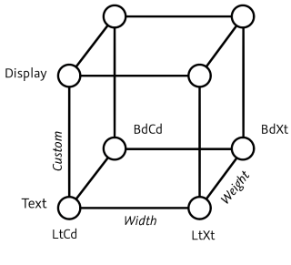
Intermediate layers a.k.a. brace layers are pretty powerful. They allow you to fine-tune interpolations for individual glyphs. The term brace layer refers to the short notation in the sidebar, which uses curly braces for displaying info. See below.
Why intermediate layers?
Why would you want to fine-tune your glyph interpolations, anyway? Fair question. Well, it frequently becomes necessary if you have an interpolation, let’s say on a Weight axis, that spans pretty far, say from Thin to Heavy.
Let’s further assume that for most glyphs, the interpolation works just fine. E.g., for your lowercase o previewing all steps with Show All Instances in Edit view gives you that pleasant and warm fuzzy feeling:

But for dense letters, you are not that lucky. Let’s take the lowercase e as an example: three horizontals between baseline and x-height, so you need to compromise on the thickness of the horizontals in the boldest master. Here is the bold e:

In the background, you can see the o for reference. You see, both horizontal curves (at the top and at the bottom) are much thinner than in the bold o. That is because we have to also squeeze the crossbar in. The crossbar itself, of course is much thinner than other horizontals. And before you ask about the blue nodes inside the crossbar: this is my favorite kitchen trick to make the curves of the counter enter the crossbar a little steeper.
In any event, this is how the e interpolates now:

Ffff... okay, let’s start with what’s positive: the beginning and the end of the interpolation, they are fine. ‘Duh’, I hear you say, that’s because they are the same as the master drawings. And you are right. In between, it gets gradually worse towards the middle of the interpolation, where the crossbar is just way too thin. Also, the horizontal curve bits at the top and bottom cause a fuzzy feeling, but this time of the negative kind in the stomach.
What if we could go where it hurts most, and fix our e there? Turns out we can.
Step 1 Find the sweet spot
First, let’s pick out a spot where it makes most sense to add an intermediate step. In our case that is the spot until which horizontals and verticals grow equally. Looking at my sequence of e’s from further above, I would guess that sweet spot is somewhere around the fourth or fifth interpolation. So, let’s look these up in File > Font Info > Exports:
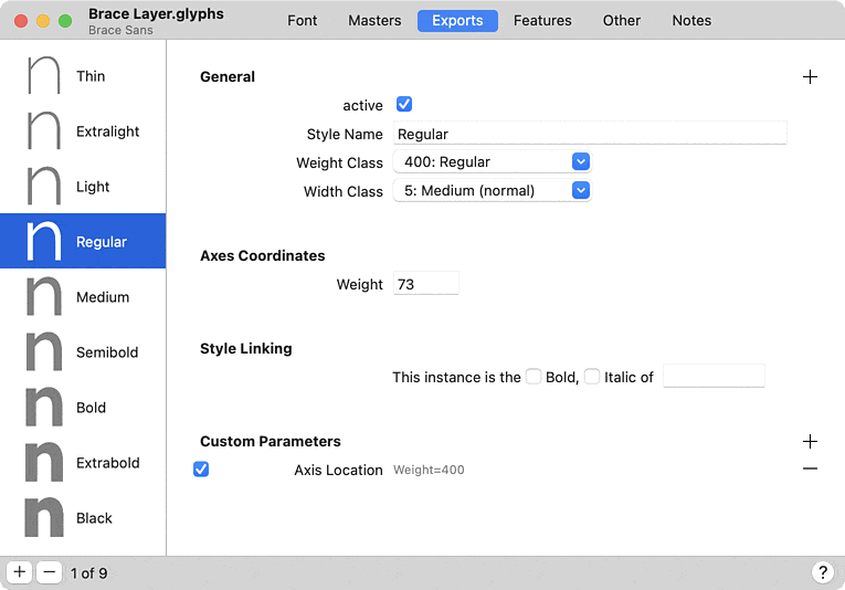
…and we get the Weight interpolation values 73 and 93. This is the approximate neighborhood where we need to intervene. Since I am indecisive today, I’ll pick 80 as a compromise. Let’s go back to our glyph in Edit view, and focus on the Layers palette. Select one of the master layers there, e.g., the first one:

Step 2 Duplicate the layer
Now press the plus button in the bottom left. A duplicate of the selected master will appear as a new backup layer, and as name it will have today’s date:

Important step now. Select that backup layer by clicking on it. It will be highlighted like this:

Step 3 Make it intermediate
This was important because new layers are not automatically selected and people have been editing the wrong layer. OK, so let’s turn this guy into an intermediate layer. You can either right-click that layer, or click on the actions menu (the triple-dot icon) to bring up this menu, from which you pick (you guessed it) Intermediate Layer:

Now a mini dialog will appear, asking you where exactly you want to put that layer in your interpolation universe:

Here, I type 80 and confirm by pressing the Return or Enter key:

Step 4 Re-interpolate
Do you still have the interpolation preview on? Then you probably noticed that our interpolation actually got worse! Look at this:

Well, you can tell what happened. Since the intermediate layer has the exact same shape as the first master, we have a half-dead interpolation until 80. Let’s fix that. We make sure our intermediate layer is still selected and bring up that pop-up menu again, either by right-clicking the layer or clicking on the actions menu. Though this time, we choose Re-Interpolate:

Boom, and the interpolation is as it was before:

Step 5 Edit
Wait, all that work for nothing? No! Now we have an editable intermediate layer, showing the outlines at 80, and we can fix them, e.g., like this:
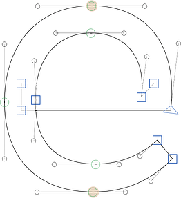
Here, I made sure, the e is still drawn as monolinear as possible. The idea is that up until this point, horizontals and verticals thicken the same. After this point, verticals thicken more than horizontals. Let’s see if it worked:

Much better. Congratulations, you have just successfully fine-tuned your interpolation. Just now, I want to fine-tune the bold master... story of my life.
Brace layer vs. master
Of course, you could just add an intermediary master in File > Font Info > Masters. But that has several disadvantages over intermediate layers a.k.a. brace layers:
- Each individual brace layer can put the intermediate step anywhere in the designspace. The
smay be better off with a brace layer at 90, theaat 70 perhaps. A full master would force you to pick one spot and stick to it for your whole glyph set. - With a full master added, you need to manage the whole glyph set. With brace layers in select glyphs, you may get away with the same or better results, but much less work.
- In a full master, you have to also manage kerning all over again. For brace layers, kerning is interpolated.
Of course, once you find yourself creating brace layers for almost all glyphs, you may be better off with a true full master in Font Info > Masters.