Multiple Masters, part 3: setting up instances
Now that you know how to create a Multiple Master setup and keep your outlines compatible, it is time to determine your instances. As it so happens, we have prepared a step-by-step tutorial for you.
Okay, so we have set up our masters for interpolation, and then, we made sure the paths in our glyphs are compatible. Now it is time to determine our instances. Each instance will be one font, or style, in the font family we are about to generate.
Setting up instances
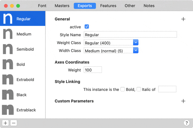
Okay, let’s get this done. Go to File > Font Info > Exports and add instances via the Plus button at the bottom left. Pick Add Instance to insert a new instance called ‘Regular’. If you pick Add Instance for Each Master, Glyphs will insert instances with the same axis coordinates as the masters defined in Font Info > Masters.

And once you already have an instance there, you can duplicate it by selecting, copying (Cmd-C) and pasting it (Cmd-V), or even more quickly, by holding down the Option key while dragging its name in the left sidebar.

All the ins and outs of naming your font family and all its instances are covered in the Naming tutorial. But for now, the most important fields will suffice: Style Name, Weight Class and Width Class, and the Axis Coordinates.
Firstly, the Style Name is usually a combination of words indicating the width (condensed to wide), the weight (light to bold), and the slope (italic or not) of a font style, in that order. The style name can be anything of course, but sticking to conventions will make your font more compatible. Occasionally, the style name goes beyond width, weight and slope, e.g., when you need to also indicate the optical size (caption to display), or any other differentiation that makes sense for your design.
In any event, the style name must be unique for each instance, so choose your style names wisely. You can use uppercase and lowercase letters, even word spaces, so there is no need to resort to the use of underscores. Figures are possible but unusual. Usually, style names are title-cased, i.e., ‘Bold Italic’, not ‘bold italic’. For maximum compatibility, it is generally a good idea to have a fallback English style name in pure ASCII. Non-ASCII style names are possible but may not be supported everywhere.
Next, take a look at the Weight and Width popups right below the name. At first sight, this may seem like a redundant repetition of the Style Name field. But it is not, because it determines the number next to it, which in turn determines the font menu order in Adobe applications. Some name-number combinations are predetermined, e.g. Regular=400, Bold=700, but if you need more differentiation, feel free to add extra numbers in between. In that case, you would simply overwrite the Weight Class value with just a number, e.g., type 550 into that field for an extra weight between Medium (500) and Semibold (600).
Finally, and most importantly, there are the Axes Coordinates for all the axes you have set up in File > Font Info > Font. Remember the stem widths we used in the first MM tutorial? In our example, it was 100 and 250. The weight interpolation value must be a number in that range. In other words, whatever number you put in here will be the stem width of this font style! Cool.
So, let us add a few instances, each of them with its own unique Style Name, Weight Class, and Axis Coordinates. This is what my instances look like now:
Note that two things are a little unusual in my example: I added a very bold ‘Extrablack’ style with weight class 950, because I ran out of named weight classes at the bold end of the weight spectrum. And I checked the Style Linking > Bold checkbox of the ‘Bold’ instance. The instance named ‘Bold’ should always be registered as the Bold of Regular. Read more about style linking in the Naming tutorial.
Previewing styles
Now go back to an Edit tab in the main window. So far, we have only edited our masters there. But now, we will preview our interpolated instances as well:

- Open and close the preview area by clicking on the eye icon in the lower left corner of the window.
- Pick an instance from the popup menu next to it, or choose to Show All Instances.
- Drag the separator line to resize the preview area.
- Use additional preview settings for inverting, flipping and blurring the preview.
By default, the preview area will center on the current glyph, but you can click and drag the preview horizontally to any other position.
Congratulations, you are now previewing your interpolated instances!
Real-world tests
Of course, the above is just a preview inside Glyphs, and you will need to export and test in other apps as well. But careful: do not install unfinished fonts in macOS, e.g., with Font Book or a third-party font manager, because you want to avoid font cache trouble. Here is how you would test:
- For WOFF and WOFF2 webfonts, you can use font test websites like FontDrop or Wakamai Fondue, or use the mekkablue script Test > Webfont Test HTML.
- For previewing CFF and TTF desktop fonts in macOS, use special testing apps like FontGoggles and TextPreview.
- Alternatively, you can use the Test Install option in File > Export > OTF (Cmd-E). The fonts will be written into the system memory, and macOS apps will receive the latest test install. You may need to restart apps for changes to take effect after a new test install. To get rid of the test-installed fonts in memory, restart your Mac or log out and back in.
- For testing CFF desktop fonts in Adobe apps, consider exporting into the Adobe Fonts folder, and all fonts will be available immediately in InDesign, Illustrator or Photoshop.
- For previewing TTFs in Windows, you can select the fonts, right click, and select Install Fonts from the context menu, then confirm that you want to overwrite the existing fonts. Windows is not plagued by cache problems as macOS is. The worst you ever have to do is restart Word.
Yes, sure, you can also test TTFs in Adobe apps, and CFFs in Windows. It is just that the Adobe renderer is optimised for CFF, and the Windows renderer prefers TTFs.
Keep your style name short
One good piece of advice: Keep your style name as short as sensibly possible in order to avoid problems in Windows. How short? Well, you are on the safe side if the combined length of family and style name does not exceed 20 characters by much. If the name is too long, Windows may think the font is invalid. We have had conflicting reports, but 29 characters seems to be a hard limit for the Family Name, and sometimes combined lengths of less have caused problems already. The only way to find out is to test-install it in Windows. If you get an error like this, consider shortening family and/or style name:

But sometimes, you will not be able to keep it short enough. Imagine a style name like Condensed Ultralight. Unless you have a very, very short family name, you will run into problems. In cases like this, use shortened versions of the parts that make up the style name. For instance, use Cd for Condensed, Xt for Extended, Lt for Light, Rg for Regular, Md for Medium, Sb for Semibold, Bd for Bold, Hv for Heavy, Bk for Black, Ultr for Ultra, etc. Then, add a custom parameter called Typographic Subfamily Name, and set its value to the long version of the name. This is going to be the name that will actually be displayed in the user interface. Speaking of which, you can also shorten the family name, and use a Typographic Family Name parameter for the unabridged version of the family name.
Again, find more details about shortened style names in the Naming tutorial.
Menu sorting
As I mentioned above, the Width Class and Weight Class popup below the name determines the order in the font family submenu, at least in Adobe applications. But how? Well, what counts are the numbers associated to the Width Class (1–9), and the Weight Class (1–1000). In a nutshell, these values are stored in the OS/2 table of your font, or the STAT table in a variable font. A smaller number equals a higher position in the font menu, and the Width Class takes precedence over the weight class.
Let’s take a closer look to the Width Class:
| Width Class | spec name | % of normal |
|---|---|---|
| 1 | Ultra-condensed | 50.0% |
| 2 | Extra-condensed | 62.5% |
| 3 | Condensed | 75.0% |
| 4 | Semi-condensed | 87.5% |
| 5 | Medium (normal) | 100.0% |
| 6 | Semi-expanded | 112.5% |
| 7 | Expanded | 125.0% |
| 8 | Extra-expanded | 150.0% |
| 9 | Ultra-expanded | 200.0% |
OS/2.usWidthClass specification
The percentages in the third column are supposed to give you an approximate idea of the relationship to the regular width. E.g., if you have a Condensed in your family, it can be expected to be approximately 75% of the average width of the Regular. But this is not set in stone, it is okay to eyeball it. If you have a width axis in your font, think about it for a moment, and then pick what makes most sense for your design.
The Weight Class is a bit more fun:
| Weight Class | Spec Name |
|---|---|
| 100 | Thin |
| 200 | Extra-light (Ultra-light) |
| 300 | Light |
| 400 | Normal (Regular) |
| 500 | Medium |
| 600 | Semi-bold (Demi-bold) |
| 700 | Bold |
| 800 | Extra-bold (Ultra-bold) |
| 900 | Black (Heavy) |
OS/2.usWeightClass specification
In the Weight Class, we have a bigger range of numbers, and thus, higher degree of freedom. If the predefined values are not enough for us, we can insert any number from 1 to 1000. Many applications will expect a regular or default weight at 400, and will look for the style-linked bold weight at 700. Other than that, we can insert weights wherever we like.
And if we only employ a weight axis, like in our example, you can leave the Width Class at its default of 5.
Distributing weights
Okay, we know how to pick a spot on the interpolation axis. But how do we know what is a good spot? Assuming we have a Light and a Bold Master, and we use their values for the Ultralight and Heavy instances, then where exactly between those two should we put the Light, Regular, the Medium, the Semibold, the Bold instances?
As a first step, it may appear to be a good start to distribute them evenly, so the difference between two subsequent weight values is always the same. E.g., your Light Master is at 20, your Bold Master is at 140. Then the instance values would be: 20, 40, 60, 80, 100, 120, and 140. The difference between two instances is always 20. We call this a linear distribution of stem weights, or simply, equal steps. But, alas, it doesn’t work that well:

There is too little difference between the instances in the middle of the spectrum. And unfortunately, this is where it counts most. They just look too similar, I couldn’t tell which one is supposed to be the Regular, the Book, or the Bold. Clearly, we need better interpolation values.
Enter interpolation theory. It was the great Luc(as) de Groot who noted that it is not the absolute difference that counts, but rather the stem growth percentage. In the above example the first step, between 20 and 40, is an increment of 100%. The the second step, between 40 and 60, only of 50% anymore. The percentages gradually decline until the end, where, between 120 and 140, we count an increment of merely 16.67%. In search of a better solution, De Groot himself suggested to keep that growth percentage constant (at least for vertical stems). This has become famous as the Luc(as) Formula or the Luc(as) distribution. According to this, the relative visual difference stays the same, whereas the absolute difference is small at first, but grows larger towards the end of the spectrum:

Certainly an improvement. The worst thing you can say about it is that there are too many light weights. Big deal, we’ll just leave out one, or we could just make one step less in total. And OK, let’s admit it, the jump between the two boldest weights is a pretty big one. But still, the last three weights would make a good set of Regular, Semibold, and Bold. Does it always work that well?
No, says the incomparable Pablo Impallari. He thinks that if you interpolate from very thin to very bold, the Luc(as) distribution causes steps to become too large at the bold end of the axis. In other words, from what looks like a Semibold, it immediately jumps to what most people would perceive as a Heavy. We could easily fit another instance in there.
In other words, if the interpolation spans from very much white and very little black (Light) all the way to very little white and very much black (Heavy), then we need smaller steps towards both ends of the axis. After all, a small step at the beginning may already cause the stem to double, and a small step at the end may cause the little white counters to be cut in half. So, at the beginning, we need a distribution that is more like the Luc(as) distribution, and at the end, we need something that looks more like a linear distribution. Mathematicians would calculate a so-called ogee curve between those two distributions. In type design land, this has become known as the Pablo distribution:

In other words, Pablo Impallari’s curve is a step-by-step interpolation from Luc(as) to linear distribution. You can use the Insert Instances script, which is part of the Masters scripts in the mekkablue script collection. The script will directly insert the instances in the Instances tab of your Font Info window.

Whichever method you choose, please see it as a starting point. The mileage varies greatly between different designs. In the end, let your eye decide the precise distribution of stem weights.
Very light weights
Especially Hairlines, Thins, and Lights suffer from grid-snapping to integer coordinates. One unit may already be a lot for a thin weight, and cause distortions when the overlaps are removed and the resulting nodes are grid-fitted. So, if you do have very light instances in your interpolation, consider disabling forced integer coordinates by setting File > Font Info > Other Settings > Grid Step to zero. Or better yet, disable it only for light instances in File > Font Info > Exports by adding a custom parameter called Grid Spacing to their respective Custom Parameters field. Set its value to zero and you are done:

Important note: the finer grid will export to OpenType/CFF fonts, i.e., fonts with PostScript outlines. Glyphs saves them with an .otf suffix. Be advised that there is software that has problems with a finer coordinate grid. In particular, PDF creation that involves Quark XPress and some old printer drivers (e.g. BR-Script drivers) have issues with decimal coordinates and may show a little dent in each path, in the area of its respective starting point.
OpenType/TT fonts, i.e., fonts with TrueType outlines, do not have that feature in the first place, and coordinates will be rounded in all .ttf fonts.
Phew, now we deserve a coffee break.
Update 2013-12-14: removed a usage note for the Insert Instances script, because it is not necessary anymore in its latest version.
Update 2015-07-20: updated for Glyphs 2.
Update 2018-11-10: updated screenshots, added screenshots for previewing in Edit view and the Grid Spacing parameter, reformulated section about naming, added warning about font installation and link to font cache tutorial.
Update 2021-01-17: first adaptations for Glyphs 3, rewrite imminent.
Update 2021-09-17: partial rewrite for Glyphs 3 of Setting up instances, Previewing styles, Keep your style name short, and Menu sorting. New chapter Real-world tests. New screenshots.