Reusing Shapes: Serif Components
There are a lot of serifs in a serif typeface. Now imagine that suddenly you realize that your serifs are a bit too thick. Do you really want to go through all your letters again, just to nudge all those pesky little serifs down a tiny little bit? Naw…
So let’s collect all different sorts of serifs, put them into separate glyphs and insert them into other letters as components.
Different Kinds of Serifs
A serif is not a serif is not a serif. There is not even much consensus as to what one serif actually is. For instance, in a serif n, some people count three serifs, others count five. For technical reasons, we will count five as well:

Now, we can build five different serifs, three of which you already see in the above picture of the n. The spur at the top left, and at the end of each stem both a left and a right serif. Which are the other two? We still need two vertical ones, like here in s and z:

Building The Serifs
To cut a log story short, fire up your Glyph > Add Glyphs dialog and copy and paste these five lines
SerifBottomLeft
SerifBottomRight
SerifSpur
SerifUpLeft
SerifUpRight
Here’s the deal. All serifs somehow attach to some sort of stem. Now imagine the origin point (where left sidebearing and baseline cross) represents the part of the stem the serif connects to.
I know, that sounds complicated. So let’s just draw the SerifBottomLeft:

It is the serif that sticks out to the left of the stem. So we imagine that the left sidebearing is the left side of the stem, and the baseline the bottom of the stem:

To be on the safe side, we’ll have a little overlap, because sometimes the stem is not completely vertical (think of an uppercase A, for instance). Slightly slanted because… well, we’ll see why later. Hold on, first we get the others right.
Here’s SerifBottomRight:

Again, the LSB is the side of the stem, but this time we have the serif that sticks out to the right, like so:

So the overlap has to be to the left of the origin point.
Next up, SerifSpur:

Oh my god, what happened here? Why did this one go below the baseline? Easy. Since the spur attaches to the top of a stem, and that top is (like the bottom) represented by the baseline, the spur must bump against the baseline from below. Just like it bumps against the top of the stem – from below:

Okay, now for the vertical ones, let’s take a look at the bottoms of s and z. This is how the vertical serifs attach to the stems here:

As you can see, it’s the lowest tip of the serif that actually attaches. So, this tip needs to stick in the origin point. Here is the SerifUpLeft as seen in the bottom left corner of the s:

…and the SerifUpRight as in the bottom right corner of the z:

Aligning Components
Why all this fuss about the origin point? Because in Glyphs, you can select a node and a component, then choose Paths > Align Selection and the origin point of the component will align with the point.
This is great news for us, since we want to precisely move serifs onto corners of stems. So here is what we do:
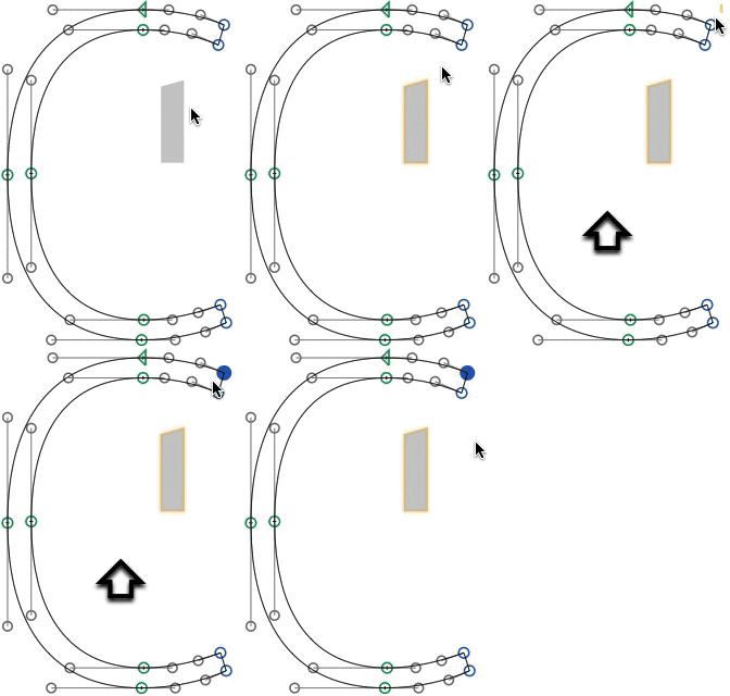
- Into the yet unseriffed letter, add the serif component with Glyph > Add Component (Cmd-Shift-C).
- Then, select the corner node of the stem we want to attach the serif to. You can drag-select the point or you can just click on it.
- Shift-click the component to add it to the selection. Both the corner node and the component should be selected now.
- Align them with Paths > Align Selection (Cmd-Shift-A). The component should fly onto the stem.
That’s it. Select a node and the component, align, and you’re done. Cool.

Turning Components Upside Down
Sometimes, we need to turn a component, for instance for the top right stroke ending of the s. We cannot mirror components because this would mess up our path orientation and we don’t want that, do we.
What we have to do to turn them upside down is rotate them. Go to your Palette (Window > Palette, Cmd-Shift-P) and set your rotation value in the Transformations section to 180 degrees.

Alternatively, you can press both the horizontal and the vertical mirror button. Both methods yield the same result. In any event, you can copy the component, rotate it and align it again, like in the s:

The value next to the arrow in the grey info box indicates a 180° turn.
Taking Advantage of Component Serifs
Now you can go ahead and experiment with your serif shapes. Have fun!
Don’t want to mix components and paths, because you do not want to risk accidental shifts? Or, what if you want bracketed serifs with a smooth transition, rather than clunky slabs? Read our tutorial about corner components to find out more!


