


Easy oblique
Now that you’ve finished the upright of your font, you’re confronted with a severe case of italic angst. An easy way out is an oblique. But in fact, even in a real italic, the caps and small caps will still need to be obliqued. Quickly find out the best method to slant your letterforms.
A good first start for creating an oblique is the Transform filter, one of the pre-installed filters that come with the standard installation of Glyphs. Your mileage may vary, but good oblique angles are usually somewhere between 6 and 12 degrees.
Choose Path > Transformations, and do not translate (i.e., leave the values at zero), do not scale (leave at 100%). But do pick an Origin: As best practice, we recommend picking half x-height because this is also what Glyphs uses for calculating italic sidebearings. That means that you can use metrics keys with cross references between LSBs and RSBs. Don’t know what that means? Take a peek at the Spacing tutorial.
Slanting vs. cursivying
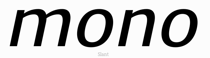
Then pick an angle and a mode of knocking your design into an italic angle. The Transform filter offers two possibilities: The first option, Slant is a simple geometric shear as you probably know it from your favorite vector application. The problem is that you will lose the weight of verticals through the distortion while your horizontals stay keep their weight. Not good.
The second option, Cursivy (click on the word Slant to switch to Cursivy), tries to counteract the distortion of curves. Here is a comparison:
But how does Cursivy know what to do? It simply makes use of your standard stems for calculating curve corrections. So do make sure you enter appropriate, average horizontal and vertical stem values in File > Font Info > Masters (Cmd-I):

Since the standard stems entered in File > Font Info > Masters determine the curve correction, you can influence the amount of correction by experimenting with different stem values. Or, even better, put the cursivied version in the foreground, and a merely slanted version in the background. Then interpolate between the two by using the slider in Path > Interpolate with Background:

This can be especially useful when the counter appears overcorrected and too pointy.
Fixing extremum points
Also, the positions of your path extrema on curves are not adjusted accordingly. This makes vertical hints impossible and some operations such as interpolation or nudging pretty difficult. If you do not care about hinting, and you are not interpolating, or relying on nudging, well, you do not need to care about your extremes. You can keep your paths like they are in this sample on the left:

However, if you need to hint your vertical stems, and plan to interpolate, it is a good idea to fix the extremes, like in this sample on the right. You can use Paths > Add Extremes, or Shift-click a curve segment with your Draw tool (P) to insert a node at the nearest extremum. To get rid of the slanted former extremums, select them one by one, and press the Delete key. Glyphs will do its best to reconstruct the curve segment as well as possible, but you may still need to adjust curvatures here and there with the Fit Curve palette (Cmd-Opt-P).
Toshi Omagari wrote a script called Path > Delete Diagonal Nodes Between Extremes that speeds up the process by trying to remove all those diagonal extremums, on all masters, at once. You can install this script, along with lots of others, by installing Toshi’s scripts from Window > Plugin Manager.
Correcting straight stems
But be careful: While Cursivy can do a pretty good job with your bowls, straight stems will still simply be slanted. But the higher your angle, the more extreme your slanting distortion, i.e., the more your vertical and right-leaning stems will thin out, and the more your left-leaning stems will bolden. So be prepared to adjust your stems a little bit afterwards. For example, slanting a vertical stem 30 degrees will thin it out by approximately 13 percent. But if the stem used to be 30 degrees left-slanted, and now is slanted into the upright, its stem weight will gain no less than 16 percent:

Needless to say, 30 degrees would be a very extreme angle. I chose it for this example to make the stem distortion more visible.
Slant height
As mentioned above already, by default, Glyphs uses half the x-height as pivot for slanting the metrics box. Above this slant height, the box bangs to the right, below the slant height, it kicks to the left. The idea is that a slanted word (or perhaps even just a few slanted letters) between upright text swings out as little as possible to either side. Typically, that will be lowercase text, so half the x-height will be the best guess for a pivot.
Sometimes, however, half the x-height does not make sense. Think of an all-caps font, for instance. In that case, you need to override the app default. To do this, open File > Font Info, switch to the Masters tab, and in the Metrics section, add a new metric, choose Slant Height as its type:

Confirm the dialog. Back in the Masters tab, enter a Slant Height, e.g. half the cap height. Now, at least in this master, all sidebearings and metrics keys will be calculated based on this pivot height.
Useful scripts and plug-ins
- Filter > Italic Extremes: plug-in for switching extremum points between slanted and upright.
- View > Show Italic: plug-in that shows the corresponding glyph from the italic in a roman and vice versa, if roman and italic are in two ifferent files and share the same family name. Also indicates if the glyph heights are the same.

- View > Show Next Font: similar to the above, but with whatever is the second font.
- The mekkablue scripts have a submenu called Compare Frontmost Fonts, which are great for comparing font info, glyph sets, glyph heights and widths, etc., between the upright and the italic.
- The script collections of Daniel Gamage and Guido Ferreyra have scripts for comparing and syncing roman and italic fonts.

Update 2015-07-30: updated screenshot for Glyphs 2.
Update 2016-12-03: partial rewrite. Updated and added screenshots, added slant distortion, extremes, titles and illustrations.
Update 2016-12-05: Added Pro Tip, moved note about slanting origin to where it belongs.
Update 2022-08-01: updated title, related articles, minor formatting.
Update 2023-04-20: Added useful scripts & plug-ins, minor formatting. Updated link to Toshi’s scripts.
Update 2023-07-11: Recreated a paragraph about Path > Transformations that got lost a year ago. Added Italic Extremes plug-in.
Update 2025-01-01: Added Slant height chapter.


