
Drawing good paths
There are two kinds of paths. Good ones and bad ones. Here’s how to spot the bad ones and how to correct or avoid the most frequent problems. You’ll be so glad you’ve read this tutorial!
Badly drawn outlines can cause headaches. Your letters may look mangled or not appear at all. You can avoid these difficulties if you keep a few basic rules in mind.
This is important: every curve segment should fit nicely in a triangle.
‘What’s a segment?’ I hear you ask. Simple, it’s everything between two adjacent on-curve points a.k.a. nodes. There are two types of segments, straight lines and curves. Straight lines only consist of those two nodes. Curve segments additionally sport two off-curve points a.k.a. Bézier control points (BCPs) or ‘handles’.
It’s important to note that the magic triangle is described by the two nodes encompassing the segment and the point where the elongations of the handles intersect. This means that the handles must never extend outside the triangle. If they do, you may want to reconsider the position of your nodes. So these two things should not happen: a handle crossing the other handle, and a handle crossing the elongation of the other handle. This may produce unnecessary inflections, cusp curves or even self-intersections, all of which may put a rasterizer into trouble.
This may come as a surprise to you if you have prior experience in vector applications like Illustrator. First, the handles do not belong to the nodes, but to the segment. Secondly, a curve segment always has two BCPs, never just one. Illustrator seems to let you draw curve segments with only one BCP. But actually, what Illustrator really does is hide the second BCP in one of the surrounding nodes. This is pretty bad because in font vectors, no two points should share the same coordinates. Plus, you have more control over the path if you make good use of both BCPs.
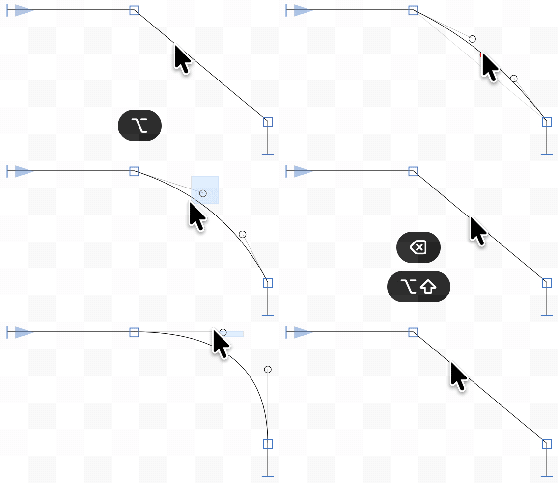
If one of the BCPs appears to be missing, it’s hiding in the node next to it. This is referred to as a zero handle or half-dead curve. The easiest way to fix this is to select a point in the vicinity, be it a handle or a node, and then tab to the hiding handle. Use Shift-tab to go into the opposite direction. A light-grey highlight indicates that the handle is selected. Now, use your arrow keys to drag the handle out of the node. If you add the option key, your handle will keep its direction. Hold down Shift for increments of 10:

You can use the Fix Zero Handles filter, available for free in Window > Plugin Manager, for the same thing. Or better yet, always use Opt-click on a line segment to convert it into a curve segment, and you will always have both handles, nicely placed, at your disposal. Hint: Shift-Opt-click to add orthogonal handles.
At first sight, the magic triangle implies that a curve segment should only have a single orientation, i.e. not inflect, not switch from clockwise to counterclockwise. There are, however, many exceptions.
Very often, you are better off without an inflection when drawing glyphs like an S or a tilde, especially if you are drawing for interpolation. If your design intention allows it, and both handles of the segment are orthogonal (i.e., vertical or horizontal), there is no technical need to add an inflection. And fewer points mean less trouble. So, wherever possible, keep it like in the s on the left side:
However, if you cannot get your s curve to flow the way you want it without an inflection point, add it by choosing the Draw tool (P), holding down the Shift key and clicking approximately in the middle of the segment. Glyphs will add an on-curve point at the nearest inflection, like in the s on the right side.
Do try to avoid inflections though, because they may create a problem in interpolation. The diagonal triplet of on-curve point and the surrounding two handles can cause a so-called ‘kink’ in interpolated steps between masters. Read more about it in the Multiple Masters tutorial on how to keep your outlines compatible, there is a whole section dedicated to kinks.
Wrong path directions can mess up counters and make proper hinting impossible. Paths need to be oriented counter-clockwise, counters need to be oriented clockwise. You can control path directions by selecting paths, right-clicking and picking Reverse Selected Contours from the context menu. Don’t wanna keep that in mind? No problem. Glyphs can do that for you. Just pick Paths > Correct Path Direction (Cmd-Shift-R) and you’re done. This command also works on multiple glyphs, or even the whole font.
By the way, Paths > Correct Path Direction (Cmd-Shift-R) also re-orders your paths and resets the starting point in each closed path.
Working with multiple masters? Hold down the Option key, and the menu command will change to Paths > Correct Path Direction for All Masters (Cmd-Opt-Shift-R), which, as the name implies, will do its magic on all layers of the selected glyph(s) simultaneously. Comes in handy when you want to quickly make a glyph with multiple masters compatible again. You can quickly cure most interpolation problems this way. Read more about keeping outlines compatible.
You can remove path overlaps and self-intersections by selecting the contour in question and choosing Path > Remove Overlap (Cmd-Shift-O) or clicking the Remove Overlap button in the Transformations panel of the right sidebar (Cmd-Opt-P). But then again, in your Glyphs file, you typically want to keep overlaps for easier editing and better interpolation. However, make sure you activate the Remove Overlap option when you export your static font (Edit > Export…, Cmd-E).
You can even add overlaps with the Open Corner and Reconnect Nodes commands from your context menu:

There is one problem with keeping overlaps though: double overlaps. That is, if you have another overlap inside an overlap. They may show as tiny white gaps inside your shapes. This can happen when, inside the overlap, a curve segment connects to a straight line, and the curve bends a little too much to the wrong side:

How can we find these spots? Well, a Python script could have a look at what your glyphs would look like after overlap removal, and see if there is some outline debris left over somewhere. In the mekkablue script repository, there is a script called Paths > New Tab with Small Paths, which opens a new Edit tab with all the glyphs it can find that contain such a tiny path:
Not really a biggie, but it can improve the rendering performance of your font: Paths > Tidy Up Paths (Cmd-Opt-Shift-T) will remove superfluous nodes and superfluous BCPs. In other words, it will remove all points not necessary for displaying the shape at hand, e.g., handles on a completely straight segment, and so on. This command will also fix the type of your nodes, thus changing a blue corner point into a green curve point (or vice versa) where appropriate. And it will fix two consecutive points sharing the exact same coordinates, also known as a ‘zero-length segment’, indicated by a red circle.
While we’re at it, a lot of stuff is much easier if you insert nodes at the x and y extremes of your paths, i.e., the spots where your paths have completely horizontal or vertical tangents. Very often, this allows you to get rid of the other points while achieving simpler paths, fewer points, smaller file sizes.
Also, if you want to make use of hinting, you need extremum points for hints to attach to the respective stem. No extremums, no stem hint. Read more about hinting.
You can either choose Paths > Add Extremes to add extrema to the selected outlines, selected glyphs or even the whole font. Or, if you want to have more control, just take your Pen tool (P) and Shift-click on the path. Glyphs will look for the nearest extremum or inflection point of the curve and insert a node there.
After you inserted extremum points, you can often get rid of intermediate points without compromising on the shape:
You do that by selecting one of the green diagonal points, and pressing the Delete key. If you delete one node at a time, Glyphs will do its best to reconstruct the shape with a single segment. Your mileage may vary.
We have talked a lot about path segments now. Yet generally, people who want to read our font will not care about segments because it is only us type designers who will ever get to see those. Rather, they care about the shape of the glyph we produce. For us though, the segments are the vehicles for producing that shape, and in the very most cases, we will have to make sure the segments fit each other in order to achieve a continuous shape. Segments do not fit by default, we have to make them fit. And this process of making segments match each other is called harmonization.
The foremost issue we have is making two consecutive curve segments fit each other. You can do that by Opt-dragging the green curve node between them. When you hold down ⌥ while dragging the node, the handles (BCPs) stay put and you can pull the green on-curve node to the sweet spot:
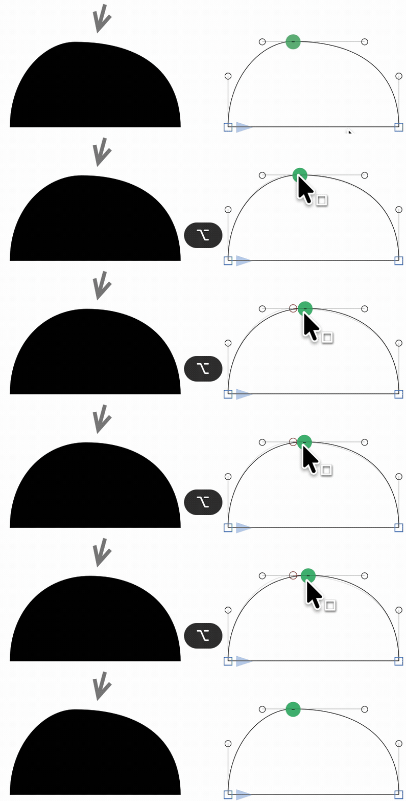
See how the bump in the curve (arrow) vanished? That is because the two curves have the same curvature where they meet each other. Mathematically spoken, their second geometric derivative matches. In font engineering, we typically abbreviate that to ‘G2’, or we say the node is ‘at its G2 position’.
Glyphs 4 adds the new star node to achieve the same goal: press Shift-Return when a green node is selected, or Shift-double click on it, to have it adopt that sweet G2 spot automatically, dynamically, and non-destructively:
But we cannot only make two consecutive segments match, we can also match two opposing segments, think the inside and outside curves of a shape. Look at these two O’s:
In the left O, the curvature (also referred to as ‘bend’ or ‘speed’) of the inside white shape (or ‘counter shape’) matches the outside black shape. In the right O, the two shapes are disharmonious, resulting in a what resembles a flat tire: in the top left, top right, bottom left and bottom right spots, in other words at about 45 degrees, the O is too thick. Sometimes the flat tire is very subtle, but trust me, once you start seeing it, you will never be able to un-see it anymore. Welcome to the club. And sorry for putting this dent in your life quality, because you will start seeing it everywhere now.
The solution is easy: make the opposing curvatures match, or ‘fit the curves’. To achieve that, we must find good handle lengths for both the inside and outside curves. As it so happens, we have the perfect tool for taking complete control of your BCPs: the Fit Curve palette in the right sidebar (⌘⌥P). What you need to do is easy: the inside needs a higher curvature than the outside. To achieve this, we double click the interior shape to select it and pick a higher Fit Curve button, then we press the Tab key ⇥ to select the next shape or choose Edit > Invert Selection (⌘⌥⇧I), and pick a lower Fit Curve button:
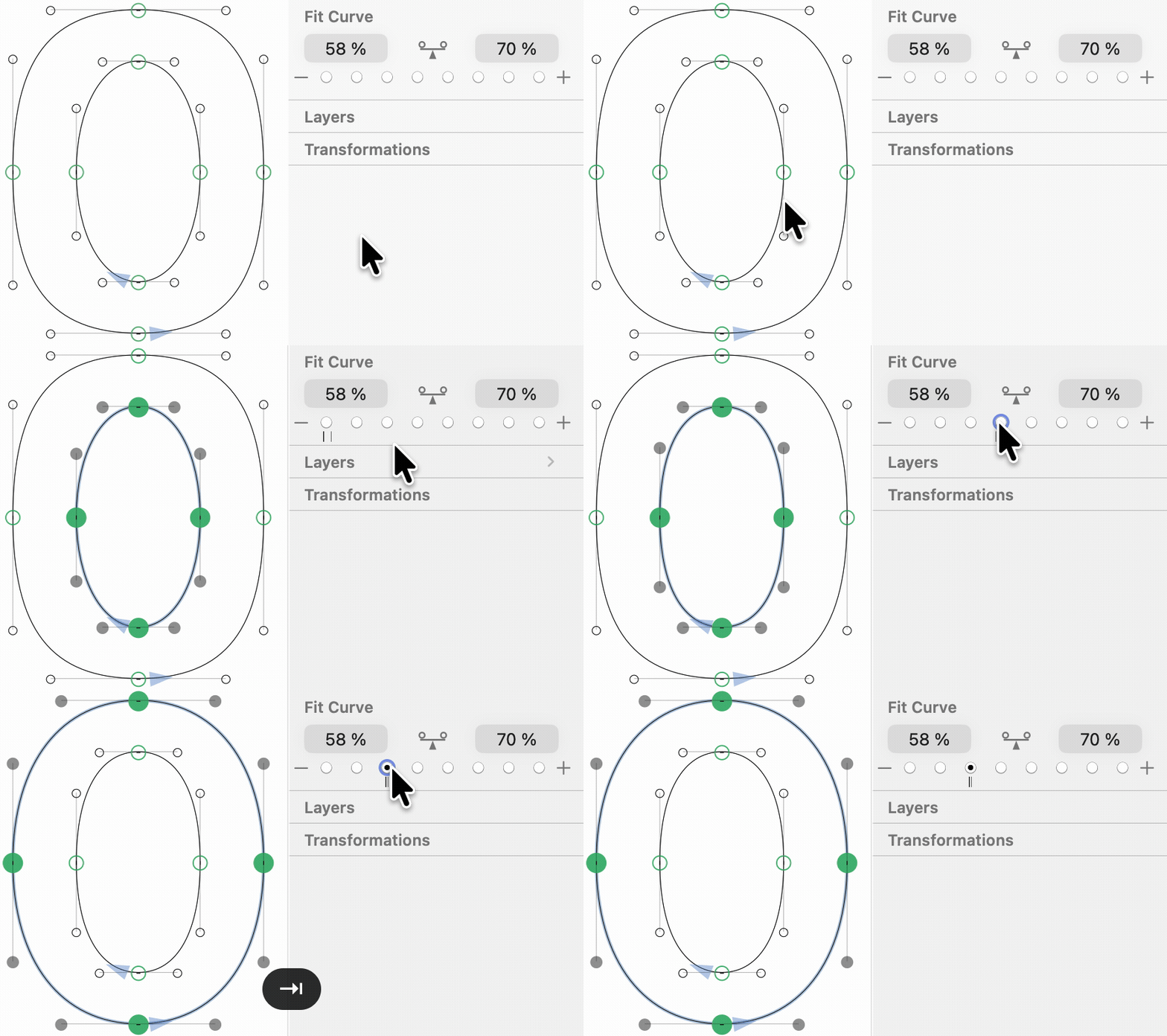
Or, even quicker, instead of clicking on the buttons, you can hold down the Ctrl (⌃) and Opt (⌥) keys and press a number key between 1 and 8, as shortcuts for the eight Fit Curve buttons.
Why more on the inside and less on the outside? Think of curvature as your max steering wheel position as you drive along the path: to achieve a smaller radius, you need to spin your steering wheel more (i.e., to a higher Fit Curve button). For wider circles, you do not need so much steering wheel.
This is what you need to know about harmony to get started. However, let me tell you that we only scratched the surface here. There is way more to it, and once you feel up to the task, feel free to take the courage and deep-dive into the advanced Harmonization tutorial.
The Fit Curve tool always produces balanced handles, i.e., both handles of a segment have the same relative length. The length of a handle is measured in percentage points, where 100% means the two handles meet in their intersection point. 0% would mean completely retracted handles. An ellipse or circle usually clocks in at a handle length of approximately 55-56%. In type design, in the very most cases, handle lengths range from just under 60% to something above 70%. Very rarely we need curvatures outside of this range.
Now, of course, we can make one handle a little shorter, and if we make the other a little longer, then the shape of the curve will, more or less, stay the same:
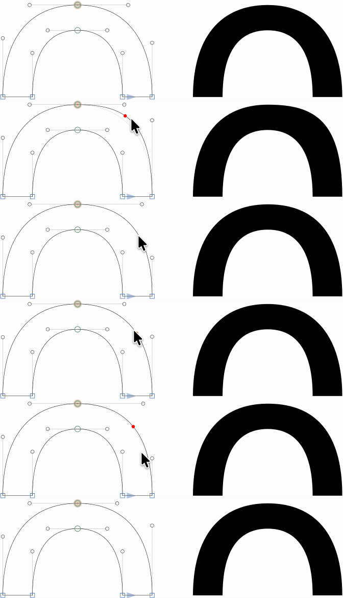
So, we can distribute the handles differently, and still have the same shape. Does that mean handle distribution does not matter? Well, yes and no.
If you have unbalanced handles, meaning one handle clearly longer, the other shorter, the actual curvature does change towards the ends of the segment, and the transition into a following straight line segment will be a bit smoother at the end of the shorter handle. But then again, there is a pay-off in interpolation. The intermediate state between clearly different handle distributions will produce a hang-through segment in between, the shape of the curve will be too flat:
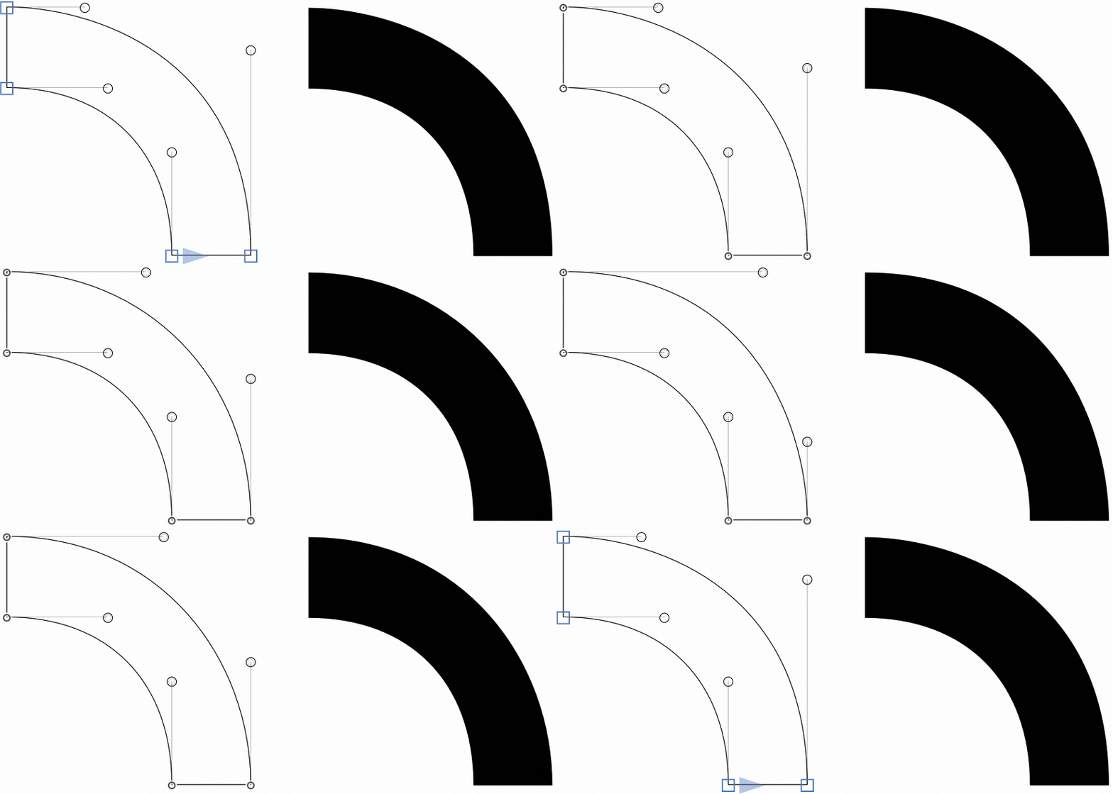
This effect can be negligible if the difference in distribution is small. In any event, you can keep it at a minimum if you balance handles from the start, e.g., by clicking on the Balance button in the Fit Curve panel of the right sidebar (⌥⌘P):
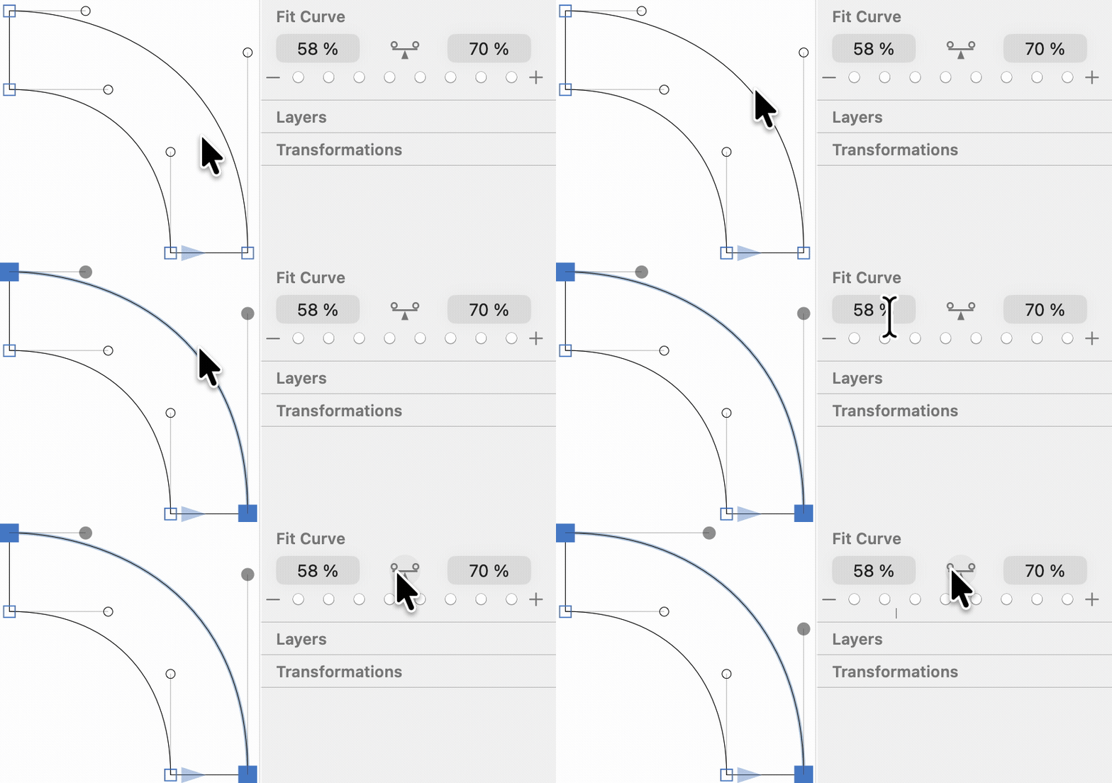
Balancing handles is sometimes referred to as Tunnification, after Eduardo Tunni, an Argentinian type designer who described a geometric way of finding an equilibrium of Bézier control points. Many third-party tools refer to his name or use terms like Tunnify.
And should an uneven distribution really become necessary after all, it probably is a good idea to recreate (more or less) the same distribution in all font masters, so the hang-through effect is kept at a minimum.
What if you need change the size of a curve? Simply scaling it will lose the stem thickness, and your curve will look too thin or too thick. Just move the nodes of one end, be it with the mouse or by the arrow keys, and you will lose the curvature. Are we doomed?
Fear not, for you can nudge! Hold down both the Ctrl (⌃) and Option (⌥) keys, and then start dragging the ends of the curve, and lo and behold, he curve magically expands, keeping both its stroke thickness and curvature:
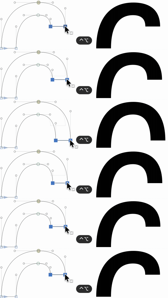
Even better, you can nudge with the arrow keys as well: Ctrl-Opt-arrowing for tiny adjustments, or add Shift (⇧) for steps of ten units. Using the arrow keys and counting the steps allows you to precisely recreate the same nudge at different parts of the outline.
Did a whole path go missing in the final font? Perhaps it was open. Open paths are ignored at export time. So, all paths should be closed.
To close a path, just drag one of the open ends onto the other one with your Edit tool (V). Or switch to the Pen tool (P) and subsequently click on both end points to add a closing segment. Alternatively, select two open path ends, and choose Connect Nodes from the context menu. Or, select an open path that is missing its closing segment, and choose Close Open Paths from the context menu.
Got super-weird left or right sidebearing values? You probably have some object way off the visible part of your glyph. Here’s how to get rid of it:
- Make sure the right glyph is active, i.e. the cursor is placed before it. Hint: pay attention to the LSB and RSB values in the grey info box (Cmd-Shift-I), and see if you can spot a ridiculously large, probably negative, number there.
- Switch to the Edit tool by clicking on the arrow symbol in the toolbar.
- Choose Edit > Select All (Cmd-A). All paths in the glyph are selected now.
- While simultaneously holding down your Shift key, drag a rectangle selection across the parts you want to keep. This will deselect them. Now, only the out-of-bounds debris remains selected.
- Hit the Delete key.
Via Window > Plugin Manager, you can put your hands on a couple of analytic Reporter plug-ins (extensions for the View menu) that help you identify potentially problematic spots in your outlines. Good plug-ins in that respect are Show Angled Handles, Jens Kutílek’s Red Arrow, Simon Cozens’ Heatmap, and perhaps Show Tops and Bottoms can also be helpful.
In the Plugin Manager, you will also find Filter menu extensions that help fix problems. Fix Zero Handles, Realign Handles and Delete Small Paths are plug-ins that do exactly what their names imply. But think of what you need for your design, and see if there is a plug-in for that.
In the mekkablue scripts, you will find a few useful scripts in the Paths submenu. One important script is Path Problem Finder, which helps find problematic spots in your outlines throughout your font. Explanations in tooltips (hover your mouse over any of the options):
While we are in the mekkablue scripts, Green Blue Manager (for aligning handles) and Find Near Vertical Misses (for finding all nodes that just miss a vertical metrics line by that much) have proven useful in the past. The Bézier Fixer script is a on-stop shop for Tunnification, G2 harmonization and realigning handles.
In Toshi Omagari’s ‘Tosche scripts’, also in Plugin Manager, you will find a Delete Diagonal Nodes script that will help clean up converted paths that have too many nodes.
Now is a good time to go through your glyphs and optimize the vectors. Trust me, it will save you some hassle later.