


Creating a pixel font
Creating a pixel font is such a fun way to get started with type design. Plus, it is really easy once you get the hang of it.
Start a new font
First, open Glyphs and select File > New (Cmd-N), to create a new font document. Now, before you start building your letters, go to File > Font Info (Cmd-I) and name your font something striking. We will call ours ‘Pixelfont’, because we’re so creative:

Then, select the tab Other, where you’ll find the options for Grid Spacing. The Grid Spacing value defines how coordinates get rounded. The default value is 1. For pixel fonts, we want all tools and all modifications to always snap to the grid, so we set higher values. This ensures that ‘pixels’ in your font are automatically on the correct position. Let’s set our Grid Spacing to 50 font units:

Why a grid step of 50? In a nutshell, we choose 50 because it divides the full type size of 1000 (also referred to as UPM, units per em) comfortably, and it gives a pixel perfect rendering at certain sizes. Either trust me with this, or do the math:
Calculating type screen sizes: Screen size is measured in PPM, pixels per em. If one em contains 1000 units, which is the default UPM (units per em) value, then (1000÷50=) 20 pixels fit into one em. In other words, one font pixel will be exactly one screen pixel at 20 PPM. For a screen resolution of 72 ppi (pixels per inch), (20 PPM ÷ 72 ppi × 72 points in an inch =) 20 points. This is the default resolution assumed for Macs and Adobe apps. On Windows, we calculate with 96 ppi, so we reach 20 PPM at (20÷96×72=) 15 points.
Drawing a pixel
In Font View (Cmd-Opt-1), click on the plus button in the bottom left of the window to add a new glyph. Double click on the name (newGlyph) to select the complete word, and rename it to pixel:

Double click the glyph area to open the glyph in a new Edit tab. You’ll see a grid according to your grid settings. Select the Rectangle tool (F or Shift-F) from the tool bar and draw a rectangle exactly as wide and high as one square of the grid is. You will notice that the path automatically snaps to the grid. Draw the square at the origin point, i.e., where the baseline crosses the left sidebearing:
Right-click anywhere on the canvas to open the context menu. Un-check the Export option. We don’t want to export our pixel, because it can’t be typed anyway and it would just waste bandwidth in our final font.

That’s literally all the paths you need for a pixel font. Now, we can skip to the good part.
Building the glyphs
Close the Edit tab with the pixel glyph you just created, and return to the Font tab. Press Cmd-Opt-1 if it does not show straight away. Now scroll up to the letters, and double click any letter you want to edit. I, for my part, choose to start with the A. In the toolbar at the top, pick the Pixel tool. It hides behind the Pencil tool, so click and hold it for a second, then pick the Pixel tool from the chooser that pops up:
Now click on the canvas to add a pixel, or click and drag your Pixel tool across the grid to add many pixels in one go. Click (or click and drag) on existing pixels to remove them again:
Draw your letter on the baseline, the second horizontal line from below. If you do not see any horizontal lines, turn on View > Show Metrics (Cmd-Shift-M). Do not worry about the size of the placeholder letter you see, it will be too big. Just focus on your pixels. Consider zooming in by pressing Cmd-plus or Opt-scrolling with your mouse.
Are you happy with the shape of your A? Then switch to the Select tool (V), the first tool you see in the toolbar, select all the pixels with Edit > Select All (Cmd-A), and determine the height of your selection in the info panel:

You see, in my case it is 300. Your number may be different. Whatever your measured height is, we go to File > Font Info (Cmd-I), switch to the Masters tab, and enter the value under Metrics > Cap Height:

Close the Font Info window and return to your A in Edit view. You can see that at the top of the letter, now sits a metric line, representing the cap height. This will help you build all the subsequent capital letters to the right height. Speaking of other letters, switch to the next glyph with View > Navigation > Show Next Glyph (End key or fn-right arrow). And should you ever need to go back, pick Show Previous Glyph (Home key or fn-left arrow) from the same submenu.
Repeat the process with x-height, ascender and descender when you reach the lowercase letters.
Editing
In order to edit the pixel glyphs, you can also use the Select tool (shortcut V). Simply click and drag a pixel to move it around:
Note how the pixel snaps to the grid. If you hold down the Option key while you move the pixels, you can duplicate them:
Technically, the pixels are so-called components of the original path-based glyph pixel. That means that the normal drag selection with the Select tool will not work, because you can only drag-select nodes of outlines, not components. However, if you hold down the Option key while drag-selecting, components touched by the selection rectangle are selected:
Analogously, the same is true for the Lasso selection, by the way. If you prefer clipboard operations, you can also cut, copy and paste, and move the components around with the arrow keys instead of the mouse.
Batch-edit the spacing
Let’s take a look at what we have so far. Switch to the Text tool (shortcut T) and type out your alphabet. Hmmm, what is wrong here:

Let me be honest with you, the default glyph width is 600 units, and that does not look so nice. When you select everything with Edit > Select All (Cmd-A), you can see in the grey info panel that the left sidebearing (LSB) is 0, but the width (also referred to advance width sometimes) and the right sidebearing (RSB) of every glyph are ‘Mult…lues’ which is supposed to mean ‘Multiple Values’. Let’s override the right sidebearing with the width of one pixel, in our case 50:

Once you hit the Return key to confirm your entry, it looks much better. See how we corrected the spacing of all selected glyphs at once? Pretty cool. You can also batch-edit in Font view (Cmd-Opt-1), with the info panel in the lower left:

Whatever you enter here is applied to each and every selected glyph.
Pixel variants
Say we want circles as pixels, not squares. We can do that. Let’s go back to Font view (Cmd-Opt-1) and duplicate our pixel glyph. To do that, select it and choose Glyph > Duplicate Glyph (Cmd-D). You will end up with pixel and pixel.001, the latter of which is automatically selected. Press the Return key …
… to change its name to pixel.square, and confirm by pressing Return again:
This will be the backup of our square pixel. Now we can edit the original pixel. Double click it to open it in a new Edit tab, and try and squeeze in a circle with the Circle tool (F or Shift-F), which may hide behind the Rectangle tool. Ooooops:
What happened? Well, think logically: we defined a grid, and every node on every outline would snap to that grid. So of course the nodes of our circle also snapped to the grid, and the circle got deformed to this funny shape. One thing is clear, we need to adapt our grid. But how?
While a square has its node in the corners of a grid unit, a circle will have its node in the middle of the grid edges. In other words, we need to subdivide every grid step into two halves. As it so happens, we can tell our font to do exactly that. Open File > Font Info (Cmd-I) and switch to the Other tab. There, change the Subdivision value to 2:

Now, we can try again to draw that circle. And lo and behold:
That’s it. The (on-curve) nodes are kept on the subdivided grid, the (off-curve) handles are not bound to the grid. We can even adjust the curvature of the circle with the Fit Curve palette (Ctrl-Opt-1 through 8), and make it more squarish or more diamondish. In any event, you can see the result right away if you type a word next to it:
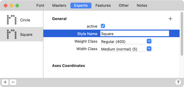
Cool. If you cannot decide on a shape, you can keep them all. Simply duplicate your pixel glyph and give it a descriptive suffix. But wait a minute, how do we get to have, preview and export all the different pixel shapes? Easy, we set up instances in File > Font Info (Cmd-I), but this time, we switch to the Exports tab. Add a new instance:

… and change its Style Name to ‘Circle’. Add another instance and call it ‘Square’. If you have more pixels already, add one instance for each pixel shape, and carry out the following steps analogously. I’ll keep it to those two for the moment:
In my case, the instance named ‘Circle’ already has the right shapes, because it uses the default pixel, which has a circle shape in it. But in the ‘Square’ instance, there are the same circles when there really should square pixels. So let’s tell that instance to swap the two pixel shapes for each other. To do that, we add a new custom parameter and search for a parameter called Rename Glyphs:

Cool, we get the documentation right at our finger tips. Feel free to read through it. (Or just do what you are being told now, the fate of people who do not want to read, har har.) Confirm the parameter with the Add button or by pressing the Return key. Now, you guessed it, click the custom parameter where it says Click here to edit value, and you are presented with a text entry field. There, type pixel=pixel.square:

This is the code that will tell Glyphs to swap the two pixel shapes for each other. Confirm by pressing OK. Congratulations, you have two instances set up, and it is time to test them. Read on.
Adjust the size
Open Window > Text Preview and pick the ‘Square’ instance, and a font size you like, and start typing away:

Whoa, what’s that! There is like a kilometer between the lines, and the letters are way too small. That is because we are designing our pixel font in a size that is much smaller than the size regular fonts default to. But we can tell our file that it has a different size. Go to File > Font Info (Cmd-I) and pick the Font tab. There, adjust the Units per Em (UPM) value. In my case, my design takes up about 30% of the size of a normal font, so I change the UPM value from 1000 to 300:

Do not forget to confirm your entry by pressing the Return key once more. Now try Window > Text Preview again:

Much better, perhaps even slightly too big. But no rush, we can always finetune the UPM value later on, when we compare our pixel font to other fonts.
Post-process with filters
Hint: for the cool stuff that follows, I assume that your default
pixelis the square, and that you have the Rename Glyphs custom parameter in your ‘Circle’ instance instead. However, if you want to keep the circle your default pixel, you will need to add the same Rename Glyphs parameter as above to the instances discussed below.
If you want to experiment a little with your font, you can try some of the built-in filters in the Filter menu. Let’s see, let’s start with a grunge version of our pixel font, and pick Filter > Roughen. (In case you had any of your letters selected, you will see that they suddenly disappear. Don’t worry about that, that is just a temporary side effect of the fact that the filter only works on paths, ignore it for now.) But what you should do now, is type in a few numbers in the dialog, but do not press OK. Instead, open the little menu with the button in the lower left corner, and pick Copy Custom Parameter:

Then, press the Cancel button. You now have the filter in your clipboard, in the shape of a custom parameter. So what are we going to do with it? That’s right, paste it. Go to File > Font Info (Cmd-I) and open the Exports tab, add a new instance via the plus button, give it a descriptive Style Name like ‘Grunge’, and paste (Cmd-V):

And there it goes, under Custom Parameters, you can see the stuff we just constructed in the filter UI, but expressed as some code in a Filter parameter. A custom parameter is some change that is being made to your font at export time. There are all kinds of parameters available. And a Filter parameter applies some action to the whole font at export that you would otherwise apply to your selection via one of the menu commands.
Let’s see if it works as expected, and take a look at the preview panel or Window > Text Preview:

Not bad for a start. You can see that each pixel gets roughened individually. That is because each pixel component is decomposed to a separate outline, and then the Roughen filter kicks in.
If we want the filter to apply to the whole shape, we need to remove the borders between the pixels. This is known as overlap removal. In other words we need to insert another custom parameter, but this time the filter that corresponds to Path > Remove Overlap. Easy. In Font Info > Exports, with the instance selected, press the plus button for adding another parameter, pick Filter, and as parameter value, you type (or copy from the Filter description, and paste) RemoveOverlap. Finally, make sure the Remove Overlap filter appears before the Roughen filter:

Let’s take a look at the result:

Much better already. Though… I don’t know about you, but the diagonals bug me. The pixels in the K or on the right in the C, they are still unconnected. Because the pixels just touched at their tips, the algorithm for overlap removal did not connect the shapes there.
Can we solve this with some more parameters? You bet. What we need to do is give the overlap-removal algorithm something to chew on, and actually create an overlap. We can do that by offsetting the paths a little bit, so the pixels grow and overlap each other, and then remove the overlap, and then offset the paths back to their original size again, before applying the Roughen filter. Are you as confused as I am now? Fear not, here is an overview:

The left side is what we did above, the result being the separated pixels. On the right side is the strategy that we are going to try now. And here is how. Choose Filter > Offset Curve and set it to offset the paths by 5 units:

…and again, do not apply it, just copy the custom parameter through the little menu in the bottom left, and cancel out of the dialog.
Okay, you know the drill already. Paste the Offset Curve parameter in the instance, and move it just before the Remove Overlap parameter. And now, trust me with this: paste it a second time, move the second Offset Curve parameter just after the Remove Overlap parameter, and click in its code and turn the part that says5;5 into -5;-5. Like this approximately:

What did we do? The first Offset Curve directive blows up all the pixels a bit, and makes our font bolder, which is not what we want at this point. So we need to deflate them again after overlap removal, by the same amount, just the opposite direction. That is why we have minus five the second time around.
Let’s see if it worked:

Yes. High five! You know, Roughen is not the only filter we can use. Very popular is rounding with the Round Corner filter, so in File > Font Info > Exports, let’s create another instance called ‘Rounded’. And from what we learned above, we already know what to do to have our shapes properly rounded. So, our strategy would be one of these:

Once again, I will opt for the one on the right because I do not want disconnected diagonals. So, I bring up Filter > Round Corners, enter a radius smaller than half of the pixel size (because a pixel may get rounded on subsequent corners), turn on Visual Corrections, copy the parameter through the little menu, cancel out of the dialog, and paste the parameter in the ‘Rounded’ instance. The other parameters, Remove Overlap and Offset Curve, I copy (Cmd-C) from the ‘Grunge’ instance and paste (Cmd-V) in the ‘Rounded’ instance. Afterwards, I drag the parameters in the right order. So translated to custom parameters, our rounding process may look like this:

Makes sense, doesn’t it? So let’s harvest the fruit of our hard labor and verify our result in the preview:

Uh-huh. Wait a minute. What about the inside corners? The filter only rounded the outside corners. How come? Well, you have stumbled across one of the hidden gems in Glyphs. Unlike the dialog, the custom parameter differentiates between inside and outside corners: positive radius values apply to outside corners only, negative radius values are for inside corners.
Cool, so we just need to add another Round Corners parameter at the end, with a negative radius. And, hint hint, it looks better if the inside radius is actually a little smaller:

And let’s put it to the test:

That’s the way uh huh uh huh I like it uh huh uh huh. OK, now I am triggered. What else can we do with filters? A lot. And it is not just built-in filters, there are a bunch of third-party filters in Window > Plugin Manager. Take your time and browse through what’s available. Even if you have looked into filters some time ago already, it is worth taking another look because there are constantly new filters being added to the Plugin Manager.
I give you one of my favorite examples, the Cut and Shake filter:

Yes, it is like a Samurai sword for your glyphs, woosh woosh! Amazing. If you care to look at the filter’s description, there is actually a few more things you can do with it. It is actually three operations in one: the random slicing, the random rotation of the sliced glyph particles, and finally the random displacement of the particles. We can choose to only do one of those, for instance just to move our pixels, but not cut or rotate them:

And it will look like this:

Ha ha, all the pixels shaken up. Cool. Now think of all the possibilities with extra parameters, or multiple instances with different values. Ha, there goes your sleep tonight.
Of course, you can also combine built-in and thord-party filters. Here is a setup with the built-in Hatch Outline filter, in combination with Delete Small Paths from the Plugin Manager:

Deleting the smallest paths after hatching is a good idea because the Hatch Outline filter may create a few very small bits and pieces. And they distract too much, so they can go, and we have nicely hatched shapes:

And now bring in the same Cut and Shake parameter we had above for the pixels, ha:

So cool. Okay, I could go on for hours, but at this point, I suppose it is much more fun to explore by yourself. Have fun!
Export
When you export your fonts with File > Export, pick the OTF option, choose Remove Overlap, but disable the Autohint option:

Keep in mind that most of your post-processed instances will count as fonts with complex outlines. That means that certain font technologies will not work, because they have been optimised for regular reading typefaces, and that is exactly what we have not created. In short, avoid hinting and disable subroutinization. I recommend adding the Disable Subroutines parameter to File > Font Info > Font:

Most importantly, do not install an unfinished font in your macOS. You will run into font cache issues. If you have not yet, read the tutorial about eliminating font cache problems now. If you have Adobe apps to test them in, consider using the Adobe Fonts folder instead.
Useful plug-ins and scripts
In Window > Plugin Manager, you will also find the Pixelate filter. It turns outline glyphs into pixel glyphs by inserting pixel components, resetting widths and moving outlines to the background:
There are a few handy scripts for Glyphs that help you with your pixel fonts. In the mekkablue scripts you'll find a submenu dedicated to pixel fonts. For more info and installation instructions take a look at the readme in the repository.
As always, with any plug-ins and scripts you install, make sure you also install all necessary modules. Read about it in the Extending Glyphs tutorial.
Update 2016-09-05: added Plugin Manager.
Update 2020-02-17: added Plug-ins for Pixel Fonts.
Update 2021-09-21: update for Glyphs 3.
Update 2022-01-02: rewrite for Glyphs 3 with new screenshots.
Update 2022-01-03: added the Export chapter.
Update 2022-07-27: updated title casing.


