Glyphs 4 Glyphs Get Glyphs

Learn

Tutorials

  • Recommended bookmarks

    Getting Started

    1. Drawing good paths
    2. Edit view
    3. Adding glyphs to your font
    4. Getting your glyph names right
    5. Spacing
    6. Eliminating font cache problems
  • Creating an Arabic font

    Been looking for a quick and easy introduction to Arabic in Glyphs? This is it.

  • Scripting Glyphs, part 1

    This multi-part tutorial will get you started with Python. You can read through it all in one morning, have lunch, and write your first scripts in the afternoon of the same day. Have fun!

  • Writing plug-ins

    Plug-ins offer additional features to software applications, usually provided by third parties. You can do it too. Don’t be shy, grab a cup of great coffee, and relax: others have done it before you.

  • Tokens

    Of course you can type all your feature code yourself. But you don’t have to. Tokens help you automate your feature code in a smart way.

  • Contextual kerning

    Glyphs offers a smart way to add your own contextual kerning in a separate OpenType feature. Warning: rather advanced level.

  • Hinting: True­Type auto­hinting

    TrueType autohinting is an easy and effective way to improve the on-screen legibility of your font on Windows.

  • Vertical metrics

    Vertical metrics determine the first baseline in a text, the distance between lines of text, and the padding to the following object below the last baseline.

  • Make your font work in Windows

    Have you also been trying to fix Windows with your font? Welcome to the club.

  • Hinting: manual True­Type hinting

    TrueType hinting is the holy grail of screen optimisation. It gives you more control over the screen-rendered shape of your glyphs than CFF/PostScript could. While it is also more complex, it is also file-size efficient, and can be done quite quickly once you get the hang of it.

  • Eliminating font cache problems

    Re-installing a font in Font Book can create font cache troubles. Here is how to avoid it.

  • Recommended bookmarks

    Learn Python

    1. Scripting Glyphs, part 1
    2. Scripting Glyphs, part 2
    3. Scripting Glyphs, part 3
    4. Scripting Glyphs, part 4
  • Extending Glyphs

    It is easy to extend Glyphs: tap into the realm of existing scripts and plug-ins, or even write your own extension. It’s easier than you may think.

  • Easy oblique

    Now that you’ve finished the upright of your font, you’re confronted with a severe case of italic angst. An easy way out is an oblique. But in fact, even in a real italic, the caps and small caps will still need to be obliqued. Quickly find out the best method to slant your letterforms.

  • Scripting Glyphs, part 3

    So, now that we’ve understood the object model, we can go on to extend our Scripts menu with our own scripts.

  • Stylistic sets

    You have more than one design that you like for the same letter? Put them into a stylistic set!

  • Creating fonts with complex outlines

    Grunge fonts, handwriting fonts, dirty letterpress fonts: if your font is complex, this tutorial is for you.

  • Diacritics

    You would like to know how to build letters with accents, umlauts, tildes and what have you? Super easy, I promise.

  • Additional masters for individual glyphs: the brace trick in Glyphs 2

    Sometimes you need an extra master, but just for a glyph, not for the whole font. Here is how you do it in Glyphs 2.

  • Alternating glyph shapes: the bracket trick in Glyphs 2

    In Glyphs 2, sometimes you will need two different forms of a glyph. The bracket trick will help you alternate glyph shapes. Attention: For Glyphs 3, read Switching Shapes instead.

  • Inter­me­diate layers

    Intermediate layers help you fine-tune interpolations for individual glyphs.

  • Creating a variable font

    Variable fonts open a whole new world of possibilities. Creating them is a breeze in Glyphs.

  • Recommended bookmarks

    Write plug-ins

    1. Writing plug-ins
    2. Localize your plug-in
    3. Scripting: upgrading to Python 3
  • Kerning

    Changing the whitespace enclosed inside a pair of glyphs is called kerning. Here’s how to do it in Glyphs, with lots of good tips to make your task easy.

  • Naming

    Font names are important because they determine font menu grouping and ordering, which is crucial for the way your fonts will appear to your users. Naming your font family can be a little tricky, so you will be happy that we shared our best tips in the following tutorial.

  • Reusing shapes: corner com­po­nents

    Corner components are pretty much like magic for creating serifs. And not only serifs.

  • Localize your font: Catalan punt volat

    In Catalonia, you will sometimes see a dot in mid air between two L’s. Here is why, and how to implement it in your font.

  • Harmo­ni­zation

    Harmony is a good thing. In type design, it has more than one special meaning.

  • Scripting Glyphs, part 4

    Functions are an efficient way to expand a script, yet keep your oversight and sanity. In this installment, we will use them for some font evil, har har.

  • Alter the glyph order in Font view

    This tutorial is an answer to a question frequently asked by converts: how do you change the order of the glyphs displayed in the Font view? You’ll see, it’s super easy and quick.

  • Rounded corners

    You probably know the Round Corners filter. You can apply it to a whole glyph or just a selection. You can even apply it to a range of glyphs at once. Nice. But there’s more to it.

  • Making small caps

    So, you’ve finished all your uppercase glyphs, and you are on a roll? Here’s how the software can generate small caps from your uppercase.

  • Scripting Glyphs, part 2

    In the first installment, we learned how to output some font and glyph info. Now we want to go a step further and actually manipulate the font. So, make a copy of your favorite font creation and warm up your Python muscles.

  • Recommended bookmarks

    Essential Font Production

    1. Naming
    2. Roll your own glyph data
    3. Vertical metrics
    4. Creating fonts with complex outlines
    5. Importing existing fonts
    6. Webfonts
    7. Porting to Glyphs
  • Mark attachment

    Non-spacing combining marks allow the user to put any accent on any character. It is possible through the magic powers of mark attachment, and easy to implement in Glyphs.

  • Pixel perfection

    Preparing a webfont? Or an icon font that is to be used on the screen? If you can control the pixel size at which it is going to be displayed, this blogpost is for you.

  • Webfonts

    Whenever you want to use custom fonts on the web, you need webfonts. And whenever you make webfonts, file size will be your main concern. Learn how to properly create WOFF and WOFF2 fonts, plus some neat tips as a bonus.

  • Custom parameters

    You have seen custom parameters in Font Info. But… what do they do, actually?

  • Importing existing fonts

    You want to manipulate an already existing font? Here are some very handy tips.

  • Importing from Illustrator

    So you have made those great designs in Adobe Illustrator and you want to turn them into a font. Find out how to best use them into Glyphs.

  • Importing from Illustrator into Glyphs Mini

    So you have prepared vector drawings in Adobe Illustrator, and want to turn them into a font. It is as easy as copy and paste, but there are a handful of details you will want to pay attention to.

  • Localize your font: Spanish inver­ted question and excla­ma­tion marks

    In Spanish, an upside-down question mark starts a question, and an inverted exclamation mark is placed at the beginning of a stressed statement.

  • Localize your font: accented Dutch IJ

    Dutch speaking people can stress their syllables by adding an acute accent to it. So, ‘ík’ is ‘ik’ with extra emphasis. There is one special case: the ij. Both the i and the j should get an accent. Problem is, there is no j with an acute. Find out an easy solution for it.

  • Localize your font: Polish kreska

    In Polish, the c, n, o, s and z can take an acute accent a.k.a. kreska, in both uppercase and lowercase. The Poles draw their acutes a little differently though. Find out all about it in this short tutorial.

  • Figures: proportional, tabular, lining and old-style figure sets

    You want to make tabular and proportional, old-style and lining figures? You’ll be amazed at how simple it is!

  • Figures: fractions

    Add numerators, denominators and a fraction slash to your font, and you can type any fraction you want. Neat, isn’t it? Well, you can accomplish this easily with the following step by step tutorial!

  • Porting to Glyphs

    When you switch to Glyphs from a different workflow, a lot becomes easier. But it’s important to mention what works differently from what you may be used to. Here are some very handy tips.

  • Roll your own glyph data

    Each glyph name has a bulk of info associated with it, from Unicode value to categorization and sorting. All this is stored in the internal glyph database, or shortly: the ‘Glyph Data’.

  • Figures: small-cap figures

    You would like to add those pretty small-cap figures to your fonts? It is so easy with Glyphs!

  • Scripting: upgrading to Python 3

    Glyphs 3 is here, and Python 2 is on its way out. This tutorial is about getting the code for your scripts and plug-ins to work in both Glyphs 2 and 3, and in both Python 2 and 3. This way, you can ensure a smooth transition for your users.

  • Recipes

    Cook your glyphs with components. Stir gently and let it boil for a few minutes, serve hot. Enjoy.

  • Why there is no Windows version of Glyphs

    Ever wondered why there is no Windows version of Glyphs? This is why.

  • Positioning with number values

    You can now define number values in font masters. They interpolate and can be used as variables in OpenType feature code.

  • System services

    In macOS, an application can provide some of its functions system-wide, i.e., outside of its own scope. This is called a system service.

  • Testing your fonts in Adobe apps

    Adobe provides a great way to quickly test your fonts. It’s fairly simple, but you need to do it exactly right. This tutorial shows you how.

  • Batch renaming

    Need to rename many glyphs? It’s so easy you’ll wonder why you don’t do it all the time.

  • Creating an icon webfont

    Turn your icon sets into webfonts, and have faster and better looking webpages!

  • Edit view

    The Edit view is your main workplace when you design in Glyphs. Here are few handy tricks to get around easily.

  • Figures: superscript (superior) and subscript (inferior) figures

    The final figure frontier: superscript, subscript and scientific subscript figures. Implement those with this quick step by step tutorial.

  • Working with UFO

    The Unified Font Object, a format for storing font data, revolutionized font production. Here is how you can integrate Glyphs into a UFO workflow and profit from features of other apps.

  • Creating a Devanagari font

    Devanagari, used for languages such as Hindi, Marathi, Nepali, and many more, is the widest used script in India. While each designer might have their own workflow, this tutorial illustrates our recommended step-by-step process to build a Devanagari font by utilizing all of Glyphs’ cool features!

  • Creating an all-caps font

    In an all-cap font, the same capital letter should appear whether the user types the key for the lowercase or the uppercase. Read the following easy step-by-step tutorial to make this happen.

  • Custom sidebar entries in font view

    You can customize your sidebar entries in the Font View. As it is very useful for verifying, sorting and filtering your glyph sets, and adding new scripts to Glyphs, it’s definitely worthwhile to learn how to do it. Plus, customizing your sidebar is quick to do!

  • Hinting: manual Post­Script hinting

    By popular request, here’s a tutorial on how to insert hints manually. Disclaimer: once again, this is pretty advanced stuff. Don’t say I didn’t warn you.

  • Hinting: Post­Script auto­hinting

    Good screen rendering at small sizes needs good hinting. But good hinting is quite a complicated matter. Therefore, you want it to happen as automatically as possible. If you follow a few simple rules, you can reach pretty good results without much work.

  • Localize your plug-in

    So you have written that great plug-in, and it works as expected, and your users are happy. But then the first complaints are in: ‘Que? No español?’ or ‘Qu’est-ce que ça veut dire? Pas de Français?’ or even ‘Jahimmelherrgottkruzifix, gibt’s denn koa Boarisch?’

    Your plug-in does not speak German, French and Spanish yet? Well, here is how to fix it. (Warning: advanced stuff in this tutorial.)

  • How to make a monoline font

    You would like to find out how to easily create the perfect monoline font. We share with you our best kept secrets.

  • Figures: slashed zero

    Add a slashed zero to your font with this quick Glyphs tip.

  • Creating a webfont in Glyphs Mini

    So, you created a font in Glyphs Mini and want to display on a web page? It’s as easy as clicking a button.

  • Creating an all-caps font in Glyphs Mini

    In an all-cap font, the same capital letter should appear whether the user types the key for the lowercase or the uppercase. Read the following easy step-by-step tutorial to make this happen with Glyphs Mini.

  • Font Info settings in Glyphs Mini

    Glyphs Mini’s Font Info section stores important general information about your font such as the font names, the vertical metrics, and the alignment zones. Once you have read the step-by-step description in this tutorial, you will be able to use it efficiently.

  • Creating a pixel font

    Creating a pixel font is such a fun way to get started with type design. Plus, it is really easy once you get the hang of it.

  • Reusing shapes: segment components

    Segment components are a great way to unify recurring shape edges. Think cupped serifs, tapered stems, ornamental sides of Tuscan-style typefaces, and the like.

  • Unicode

    For your font to work properly, some of your glyphs need proper Unicodes. Here is essentially what you need to know about it as a type designer.

  • Creating a Hangeul font

    Creating a new Korean font, with such a large character set, can seem like a daunting task—where to begin? This tutorial will give you all the tools to get started with Korean and show you the basics of creating a new Korean font in Glyphs.

  • Reusing shapes: component tricks

    You know about serif components, smart components and corner components but you are still craving more components? These tips and tricks will make you happy.

  • Reusing shapes: smart components

    Smart Components are a fantastic way for re-using partial glyph shapes, especially for CJK radicals, but also for Latin letter parts. Be smart, and find out how to do it!

  • Advanced diacritics: multiple anchors

    Sometimes, marks can have different positions. This is when you need more than one anchor. Warning: fun type nerdery ahead.

  • Advanced diacritics: narrow marks

    Refine your type design by adding special marks for your narrow letters.

  • Features, part 2: con­textual sub­sti­tutions

    You want to substitute glyphs, but only under certain circumstances? Contextual substitutions are the way to go.

  • Features, part 4: positional alternates

    What makes a script font really neat, is when it has a bunch of alternative glyphs for different positions, and the right OpenType features to trigger them. Find out how to do it right in this tutorial.

  • Spacing

    Determining the sidebearings, i.e. the vital spaces to the right and left sides of your glyphs, is called spacing. Spacing is very important to the overall quality of your design. Here are our best tips to do it successfully in Glyphs.

  • Features, part 1: simple sub­stitutions

    No modern font is complete without them, and Glyphs helps you build them. In this first installment about OpenType features, we’ll explore the very basics and what Glyphs can automate for you.

  • Ligatures

    You would love to know how to create ligatures? It’s super easy. Try it.

  • Switching shapes

    Sometimes, a shape needs to change when it interpolates from light to bold. Glyphs offers two solutions.

  • Drawing good paths

    There are two kinds of paths. Good ones and bad ones. Here’s how to spot the bad ones and how to correct or avoid the most frequent problems. You’ll be so glad you’ve read this tutorial!

  • Video: drawing paths

  • Advanced diacritics: adapted base letters

    Imagine having letters that react to the diacritic mark on top of them, like a lowercase g that shifts its ear to make space for a circumflex. Neat, right? Simple, too. Here is how you do that.

  • Features, part 3: advanced contextual alternates

    You are designing a handwritten font with loads of alternates for each letter? This tutorial is for you. I hope you appreciate Swedish pop music.

  • How to install your Glyphs license

    You finally got your download link for your Glyphs license via email and now you don’t know what to do with it? No worries, we’ve got you.

  • Creating a Micro­soft color font (CPAL/‌COLR)

    Microsoft proposed a format for color fonts entirely based on vectors. Glyphs allows you to create and directly export such a color font. Plus, the app takes care of the technical stuff for you.

  • Creating an Apple color font (sbix)

    Ever wondered how those Emoji fonts work on the Mac and the iPhone? The pictures are nothing but colored bitmap images embedded in the font.

  • Creating an SVG color font

    Glyphs offers various ways to create an OpenType-SVG font. Read the following tutorial to know almost everything about it.

  • Sketching

    There are many approaches to finding your letterforms. Many designers like to do a manual sketch first, and then digitize it. Most methods, if not all, have in common that they trace the shapes back to a specific tool. Here are two popular ways to get you started now with sketching your font.

  • Older versions of Glyphs

    Sometimes, you find yourself in a situation where you need a Glyphs version different from the latest and greatest one. Here’s how to get hold of them.

  • Getting your glyph names right

    Correct glyph names are the key to a lot of nifty features in Glyphs. Here’s how to get them right.

  • Adding glyphs to your font

    There are quite a few ways of adding new glyphs to your font. Here is a pretty handy overview.

  • Alternating glyph shapes with multiple axes in Glyphs 2

    In Glyphs 2, if you have two or more axes, the bracket trick is too complex. Attention: For Glyphs 3, read Switching Shapes instead.

  • Multiple Masters, part 3: setting up instances

    Now that you know how to create a Multiple Master setup and keep your outlines compatible, it is time to determine your instances. As it so happens, we have prepared a step-by-step tutorial for you.

  • Creating a layered color font

    With Glyphs, creating layered color fonts is a snap. Find out how.

  • Multiple Masters, part 1: setting up masters

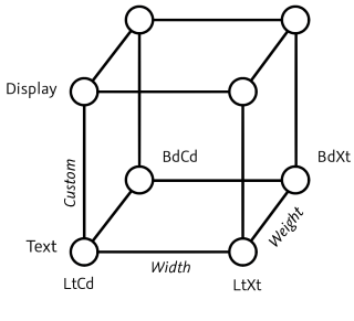
    Thinking about producing a large font family? Then you need to draw and manage more than one master and to understand interpolation.

  • Video: building diacritics

  • Install Glyphs for all users

    Need to install Glyphs or Glyphs Mini for many users on a machine, e.g., in a lab? Here is how to do it quickly.

  • Crashes

    Are you experiencing application crashes? Here is what you can do to help us fix the problem as soon as possible.

  • Multiple Masters, part 2: keeping your outlines compatible

    Let’s now learn how to make compatible drawings that are ready for interpolation in Glyphs.

  • Cannot download or update Glyphs?

    Safari can’t reach the server? Site cannot be reached? Glyphs will not update? Window > Plugin Manager stays blank? Here is how to fix it, and make your downloads work again.

  • Creating an SF Symbol

    SF Symbols are a great way of adding adaptable icons to your Xcode projects. Here is how you make them in Glyphs.

  • Reusing shapes: brushes

    Brushes are a fantastic way to expand mere path segments into full-blown shapes. Let’s draw an arrow.

  • Troubleshooting a font that does not export

    Sometimes, you try to export a font but instead you get weird error messages. Here is how to fix that.

  • Localize your font: Roma­nian and Mol­do­van comma accent

    For Romanian and latin Moldovan, your font needs comma accent letters, in particular S/s and T/t. With this tutorial it is simple to get them right and to implement them.

  • Creating a pixel font in Glyphs Mini

    A pixel font is such a fun and easy way to get started in Glyphs Mini. Plus, all your friends will want to use it!

  • Localize your font: Turkish i

    Turkish and a couple of related languages distinguish between an İ/i with dot and an I/ı without a dot. If you plan to have small caps and ligatures in your font, you should take a few minutes to read this.

  • → List all tutorials

Handbook

Read the most up-to-date online handbook for Glyphs 4.

→ Read on a single page

Courses

  • Script Fonts Course by Viktor Baltus

    In this online video course which you can take at your own pace, in your own time, you’ll be making your script fonts directly in Glyphs. You’ll start of by learning how to shape your characters with clean smooth curves, consistent weights, and a flowing connections.

    English, beginner and intermediate, starting USD 249.

    → Start the course
    • EN
  • Lynne Yun: Type Design School

    In Lynne Yun’s online type design school, you will learn what ‘you need to know before embarking on your first typeface design, and then carrying it to the finish line.’ English and Spanish closed captions are available for all video content.

    Beginner and intermediate. Free, donations appreciated.

    → Start the course
    • EN
    • ES
  • Plau: Tipografia avançada para marcas

    Neste curso online, descobrirá o fascinante mundo da tipografia pop na companhia de Carlos Mignot e Rodrigo Saiani, do Estúdio Plau. Mergulhe no universo das letras e aprenda a criar tipografias para identidades de marca inspiradas no espírito da cultura pop.

    Nivel: iniciante, 21 aulas (4h 40m)

    → Start the course
    • PT
  • Font Making Course by Viktor Baltus

    Curated online class with individual professional feedback, 60+ pre-recorded videos, guidebooks and access to a community forum. Live at least once a year, look for upcoming classes on the website.

    English (Spanish subtitles available), beginner and intermediate, starting USD 325.

    → Start the course
    • EN
    • ES
  • Type Design Course with Kaleb Dean

    Series of tutorial videos by Kaleb Dean about various aspects of type design with Glyphs. Includes a master class that takes you from finding inspiration to finishing your first font. Plus many videos with advanced tips and techniques.

    All levels, various lengths, YouTube playlist. Free.

    → Start the course
    • EN
  • Juanjo López: Diseño de una tipografía digital

    ¡Aprende a diseñar una tipografía desde cero con Glyphs, Illustrator y funciones OpenType! Juanjo López, más conocido como Juanjez y especialista en diseño de letras, te enseñará el proceso de creación de una tipografía digital. Desde el dibujo hasta dejarla lista para ser instalada en tu carpeta de fuentes y usarla en un programa de diseño.

    Español, iniciación, 8h 37m, desde €19,90

    → Start the course
    • ES
  • Typearture: Create your own variable font

    Learn how to create your own variable color font with Arthur Reinders Folmer a.k.a. typearture. The course consists of 11+3 video lessons. They cover everything from creating to implementing a variable font.

    English, all levels, online video course, introductory pricing EUR 109

    → Start the course
    • EN
  • Kevin King: typeface design screencast

    Canadian type designer Kevin King has published a series of 29 in-depth screencasts about type design in Glyphs in his Youtube channel. Watch, listen and learn as Kevin steps you through the process of making a Latin font family.

    English, beginner, intermediate and advanced, Youtube playlist

    → Start the course
    • EN
  • Jenny Lee: Create your own hand drawn font

    Learn how designer and illustrator Jenny Lee of Hello Brio Studio creates hand drawn fonts. In this 50-minute class, you’ll learn all the steps of font-making from sketching to digitizing. By the end, you’ll have a personalised all-caps font that you love.

    English, beginner, 50m, Skillshare subscription

    → Start the course
    • EN
  • Daniel Nisbet’s YouTube classes

    Free set of Latin-based type design courses on YouTube by designer and TypeWknd co-founder Daniel Nisbet. Classes also cover Glyphs Mini.

    Beginner and intermediate, YouTube videos

    → Start the course
    • EN
  • Charles Nix: Glyphs essential training

    Charles Nix leads a tour of the Glyphs workspace and then coaches you through the construction of a complete font—from outline to stroke, stroke to character, characters to typeface. There are special sections dedicated to spacing, kerning, optional OpenType features, and font testing and export. Charles also shows how to create type families with multiple masters.

    LinkedIn Learning: English, intermediate, 3h, EUR 35

    → Start the course
    • EN
  • Charles Nix: Design a condensed sans serif

    Learn the basics of constructing a condensed sans-serif font using Glyphs App, the premier software for designing type. Instructor Charles Nix takes you through the design process along a logical path, building from simple elements to a complete font. He shows how to create lowercase and uppercase forms, as well as numbers and punctuation. Once the font is complete, learn about refining it with spacing and kerning, and discover strategies for making the font your own.

    LinkedIn Learning: English, intermediate, 2h 10m, EUR 40

    → Start the course
    • EN
  • Charles Nix: Design an italic typeface

    In this course, instructor Charles Nix takes you through the entire process of designing an italic typeface, building from an upright roman script to the italic form. He shows how to create capital and lowercase characters, as well as punctuation, while examining aspects such as slant, stem width, serif shape, and other fundamental differences between the roman and italic forms. Once the font is complete, he refines it with spacing and kerning, and introduces strategies for generating and testing the final font files.

    LinkedIn Learning: English, intermediate, 2h 48m, EUR 40

    → Start the course
    • EN
  • Wete: Introduction to Glyphs

    Comprehensive online course by Barcelona-based desigenr Juanra Pastor Rovira (Wete): Learn how to use all the tools offered by the software to design and create your own fonts from scratch. Spanish with English subtitles.

    Domestika: 57 lessons, 9+ hours, EUR 39.90

    → Start the course
    • ES
    • EN
  • Matthew Smith: Lettering in Glyphs

    Get started in Glyphs with this one-hour screencast on how to create a piece of lettering digitally. Watch lettering artist and type designer Matthew Smith do his infamous ‘Cutie’ lettering. And you cannot beat that price: it’s free for you to watch! Enjoy.

    English, beginner, 1h 5m, Youtube

    → Start the course
    • EN
  • Winston Scully: Vector lettering & logos with Glyphs

    Join designer Winston Scully producing a piece of lettering in Glyphs. And while you are on his YouTube page, check out his other insightful videos.

    English, beginner, 20m, YouTube

    → Start the course
    • EN
  • Tyler Finck’s type design tips

    Tyler Finck has a bunch of screencasts about making fonts in his Youtube channel, specifically about getting started. Including short tutorials about variable fonts and Glyphs Mini.

    English, beginner and intermediate, YouTube channel

    → Start the course
    • EN
  • Giuseppe Salerno: Pillole di Glyphs

    Take a peek over Italian calligrapher and type designer Giuseppe Salerno’s shoulder as he takes you through his design workflow in this enlightening series of short screencasts in his YouTube channel. It is free, and best of all, it is universal because it uses no language at all.

    Beginner and intermediate, YouTube channel

    → Start the course
    • EN
  • Carina Gardner’s Dingbat Design Academy

    Being able to make dingbats allows you to showcase your work in more online shops. This course is 3 lessons long including video modules and bonus lessons teaching you the fundamentals of dingbat design. It is your opening step into the world of font creation.

    English, beginner/intermediate, USD 199

    → Start the course
    • EN
  • Grafikar: Création police de caractère Arabe

    Arabic type design and font manufacturing tutorials by French studio Grafikar Fonts.

    All levels, various lengths, YouTube playlist.

    → Start the course
    • FR
  • Khalid Alabdullah: Making Arabic fonts using Glyphs

    الحلقة الأولى في صناعة الخطوط العربية على الماك باستخدام برنامج Glyphs. وفيها استعراض سريع للبرنامج مع بيان امكانياته التي تسهل صناعة الخطوط العربية.

    Beginner and intermediate, 25min, YouTube video.

    → Start the course
    • AR
  • Alex Slobzheninov: Type design process

    ‘Type design process’ playlist of YouTube videos. Among which a recorded live stream of Alex designing a typeface in Glyphs.

    All levels, various lengths, YouTube playlist.

    → Start the course
    • EN
  • Arrow Type: advanced type design videos

    Stephen Nixon (Arrow Type) gives exclusive insights in his fontmaking process. Topics covered include italics, interpolation, and Vietnamese diacritics.

    Intermediate to advanced, various lengths, YouTube videos.

    → Start the course
    • EN
  • Adam Greasley: How to design a font

    Series of short tutorial videos about various aspects of type design in Glyphs. Covering, among other things, kerning, ink traps and ligatures.

    Beginner to intermediate, various lengths, YouTube playlist.

    → Start the course
    • EN

Books

  • Glyphs Type Design

    노은유 Eunyou Noh & 함민주 Minjoo Ham

    글립스의 한글화는 물론 게오르크 자이페르트와 협업해 한글을 위해 특별히 만든 ‘한글 조합 그룹’ 개발에 참여하고 다년간 타이포그래피를 강의해 온 저자들이 집필한 이 책은 현존하는 프로그램 가운데 가장 한글 친화적인 폰트 제작 프로그램인 글립스를 활용해 ‘나만의 글꼴’이라는, 과거라면 엄두도 내지 못했을 일을 실현해 준다.
    → More info KO
  • Glyphs 字体设计手册

    3type

    这是一本专为中国用户定制的软件操作手册,这不是一本出版物,而是软件售价或升级的抵扣! The Chinese-language manual covers all aspects of the software, written by the very people who translated Glyphs for Chinese. For a small contribution to the printing costs, you can get a printed copy, and the amount will be deducted when you buy a Glyphs.app license! 有关更多信息,请联系:hi at 3type dot cn
    → More info ZN
  • Making Fonts!

    Chris Campe & Ulrike Rausch

    Der Einstieg ins professionelle Type-Design: Making Fonts! ebnet Ihnen den Weg ins professionelle Type-Design. Anschaulich, fundiert und mit ansteckender Freude führen Chris Campe und Ulrike Rausch Sie von der Buchstabenskizze zur eigenen Schrift.

    → More info DE
  • BlazeType: How to Design Fonts?

    Published by Blaze Type

    Whether experienced or beginner: learn everything you need to know to design fonts from A to Z. From sketching to design and production, you’ll master all the skills to become a professional font designer. Written by Matthieu Salvaggio and Léon Hugues, Blaze Type foundry, EUR 17 for a PDF version, EUR 45 for a printed copy.
    → More info EN
  • Designing Fonts

    Chris Campe & Ulrike Rausch

    An Introduction to Professional Type Design: Learn the basics of type design, from sketched letters to finished font, in this uncomplicated but thorough introduction to type design.

    → More info EN